Not impressed if right
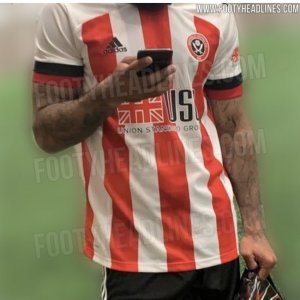
Home -
Positives are the thickness of the stripes and red in the middle. The middle part is fine but need to see the collar and back of course.
Negatives - I don't like the sleeves at all. Too much white on our shirts never works. We are more red if anything and any trim on the sleeves or solid colour needs to be red or even black. More white makes me think of Stoke or Southampton when it comes to the design.
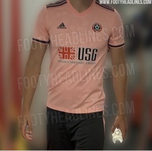
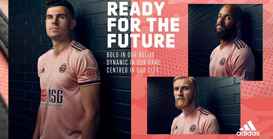
Away -
Positives- New colour. Like us to try different things and move away from always doing lime or white. No problem with pink either. The colour itself being quite adventurous means it needs to be simple and fresh. So no probs with how it looks.
Negatives - Template kit and lazy in the senn Leicester got a pink adidas away already. Like we are the hand me downs ...a kid brother. Leicesters has the Germany
1990 design incorporated too so is better than purs. We just get a template catalogue one. Its quite dull in the sense the pink seems too dark and not vibrant enough. Also surely this clashes with red making it a kit we can't really wear much. Maybe get away with v Southampton but Liverpool, Arsenal etc it won't work.
---
Overall not keen and a big drop off from this season ...will rate these on our final part of our kit podcast (caveat being these are not confirmed)
 www.footyheadlines.com