The eyesore sponsor

All advertisments are hidden for logged in members, why not log in/register?

Eric Cartman

Active Member
Joined
Mar 12, 2018
Messages
2,192
Reaction score
2,681
Location
Sheffield
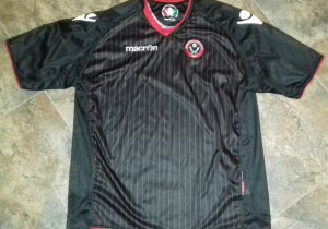
The garish, eyesore of a sponsor. Surely the colour scheme makes it the ugliest we’ve ever had? it’s even worse than the cardboard DeSun one.

Have a word with the club and they might have a rethink. We can’t change the kit to have stripes on the back but we can surely change this. The power is in the customers hand :)

Plain black lettering with no box background turns this kit from a 2/10 to a 6/10

If they know it’s not going to sell I’m sure they’ll rethink. Like they did with that Visit Malta kit way back.

https://www.sufc.co.uk/contact-us/


The garish, eyesore of a sponsor. Surely the colour scheme makes it the ugliest we’ve ever had? it’s even worse than the cardboard DeSun one.

Have a word with the club and they might have a rethink. We can’t change the kit to have stripes on the back but we can surely change this. The power is in the customers hand :)

Plain black lettering with no box background turns this kit from a 2/10 to a 6/10

If they know it’s not going to sell I’m sure they’ll rethink. Like they did with that Visit Malta kit way back.

https://www.sufc.co.uk/contact-us/
He who pays the piper calls the tune.
 
And they need to felt tip some red stripes on the sleeves whilst they're at it.

Hopefully the away kit is a belter for a change
 
One too many sangrias in the sun mods could you please get rid of the random S, in the title please which seems to have somehow relocated from ponsor:..? Foxy

Much appreciated :)
 
And they need to felt tip some red stripes on the sleeves whilst they're at it.

Hopefully the away kit is a belter for a change
I might just paint them on. It’s the spinsor that irks me.
 
I rarely buy kits because I don’t want to advertise some random company. But take the sponsor off this one and I’d buy it.

I prefer it to last season’s kit.
 
The garish, eyesore of a sponsor. Surely the colour scheme makes it the ugliest we’ve ever had? it’s even worse than the cardboard DeSun one.

Have a word with the club and they might have a rethink. We can’t change the kit to have stripes on the back but we can surely change this. The power is in the customers hand :)

Plain black lettering with no box background turns this kit from a 2/10 to a 6/10

If they know it’s not going to sell I’m sure they’ll rethink. Like they did with that Visit Malta kit way back.

https://www.sufc.co.uk/contact-us/
I’m not totally convinced that green text in a box will be the final offering based on what Jim Phipps Tweeted. Let’s hope so anyway.
 
This green panel is it real Desso.

What a brilliant idea, next season get Desso to sponsor us, and then all our shirts will say 'GrassMaster', I'll fit right in round S20. You get high as a kite here just from going outside.


Personally I wouldn’t buy one. But my footy shirt buying days finished years ago. My main beef as a ST holder sitting where Westfield meet the BLUT is seeing my beloved Blades marauding towards the Kop, looking like fucking Derby.
 
I'm not a fan of sponsors on shirts.
As an experiment, I used some isopropyl to remove the "Visit Malta" from one of my shirts. I flipped the shirt inside out and applied it dropwise to the back of the transfer, which bubbled-up and came off. Turned out pretty good.
shirt.png
 
I'm not a fan of sponsors on shirts.
As an experiment, I used some isopropyl to remove the "Visit Malta" from one of my shirts. I flipped the shirt inside out and applied it dropwise to the back of the transfer, which bubbled-up and came off. Turned out pretty good.
View attachment 41029

The stuck on stuff on those shirts is notoriously shit though isn't it? Was on the one I have, I've got the macron man on one shoulder only and the visit Malta cracked and started to peel.

Need to try it on something more hardy. The anniversary Adidas one might be a good one to test on.
 
Personally I wouldn’t buy one. But my footy shirt buying days finished years ago. My main beef as a ST holder sitting where Westfield meet the BLUT is seeing my beloved Blades marauding towards the Kop, looking like fucking Derby.
Now when they’re attacking towards the BLUT they’ll look like Derby, So, small mercies :)
 
Forgot about those. Or just more rather blocked them out my memory.

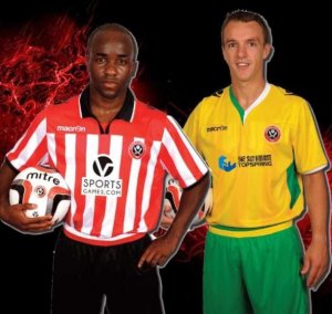
The single worst kit promotion picture from a professional sports team I’ve ever seen too. I did better in year 9 ICT.

View attachment 41030

Yeah, one notable thing about the past few years is that we've certainly smartened up the media/marketing side of things.
 
What in the name of fuck was that away shirt about?? Green, yellow, red, black, white and two shades of blue. The fucking collar is half green and half white ffs. Bad times those.
 
Forgot about those. Or just more rather blocked them out my memory.

The single worst kit promotion picture from a professional sports team I’ve ever seen too. I did better in year 9 ICT.

View attachment 41030
Is that what George Ezra is singing about in that song called Shotgun,he mentions Yellow and Green you know what i mean.


All advertisments are hidden for logged in members, why not log in/register?

All advertisments are hidden for logged in members, why not log in/register?

Back
Top Bottom