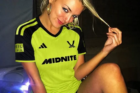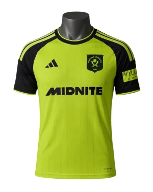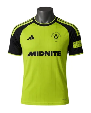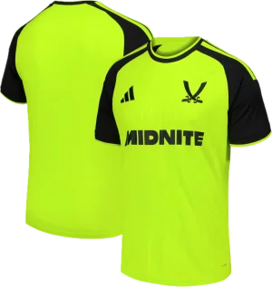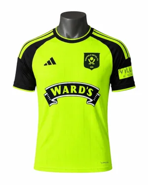
CONFIRMED Next seasons kit

All advertisments are hidden for logged in members, why not log in/register?


It really is sad and shows how far this club has fallen under the chuckle brothers that the most commented thread recently is about the fucking kit.
 
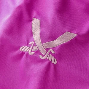
I really like the big swords, to be honest. Cleaner aesthetic.
Would never want it on a home shirt, but I like it on an away.
Dont dislike the big swords as some on here, just feel they have tried to modernise that retro one (which is a nice shirt imo) and they should have gone with the same retro badge/crest. Maybe they should have done same 90s crest but leave the shield out to be more cleaner.

I actually dont mind the kit either (long as its more brighter/luminous colour in person), and it is paired with black shorts and socks.
 
Meh. Underwhelming. I myself have designed much better, as have many on here. We wont ever get anything special from adidas, just templates. Seen one, youve seen em all i guess.
 
I really like the big blades (not swords) crest.

Baffled why they’d use it with the modern adidas logo though.

Because the cut was diagonal I dont think it would have given sufficient room ie the black would encroach upon the blades which would also have been in black
But I agree it'd have rocked even more with the simplified logo
It could have been in white..?


All advertisments are hidden for logged in members, why not log in/register?

All advertisments are hidden for logged in members, why not log in/register?

Back
Top Bottom