SwissBlade
Well-Known Member
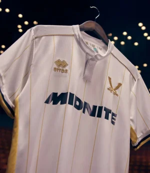
It’s a shame it’ll probably fall off after a washAt least they can sew this one on straight. Probably
Follow along with the video below to see how to install our site as a web app on your home screen.
Note: This feature may not be available in some browsers.
All advertisments are hidden for logged in members, why not log in/register?
It’s a shame it’ll probably fall off after a washAt least they can sew this one on straight. Probably
Although Tickhill Blade just seen a close up and it’s been embroided on…It’s a shame it’ll probably fall off after a wash

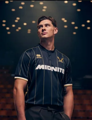
So don'tThe only thing I don’t like is having to choose between the white and the black one.
")
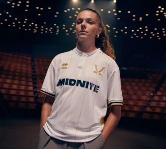
The one thing they don’t ever need to fuck about with on the shirts is the badge design.


It might be on straight, but can they get it in the middle of the 2 stripes?Although Tickhill Blade just seen a close up and it’s been embroided on…

They’ve created a solution to a problem that they’ve created. Just change the colour of our badge to gold, if they want.The mistake they're making is that they're scaling it to the same size as the proper badge.
But our proper badge is a circle within a circle with the swords inside the inner circle so they're obviously smaller.
That's why your eye is immediately drawn to it and it looks so wrong.
View attachment 217033

Are you on commission at the club shop?So don't
It might be on straight, but can they get it in the middle of the 2 stripes?
View attachment 217037
Design? There’s no design element to it whatsoever.the best design Errea have done
It doesn't matter. You're not getting the point. It was awful then and it's awful now. Just give us the fucking stripes front and back. Leave the plain red backs to the teams that play in plain red shirts.
Sounds like some of my dates…Barking tree frog?
More like barking mad fiftysummat lass at local wi lip fillers and a bum lift who still thinks she's sexy...

Is it just Errea though, or has there been a rule change that i'm unaware of?Very nice kit, the swords as an alternative to the club badge in the past 2 years has been a great addition and credit to Errea for that.


This is what happens when you use Crabber...Sounds like some of my dates…
Is it just Errea though, or has there been a rule change that i'm unaware of?
Last couple of seasons we've had LOTS of teams have retro badges applied to their Away or 3rd strips, whilst leaving their home shirt with the normal badge. The pigs 3rd shirt will feature their classic badge this season.
These are all shirts from last season, either it's 1 big coincidence, or there was a rule change allowing the use of 2 different crests in the same season:
View attachment 217044View attachment 217045View attachment 217047View attachment 217048View attachment 217049View attachment 217053View attachment 217054View attachment 217055View attachment 217056View attachment 217057
My point is/was we have it every few years. Was questioning why the reaction is off the scale this time round, as opposed to “I see they’ve done the plain back thing again”.It doesn't matter. You're not getting the point. It was awful then and it's awful now. Just give us the fucking stripes front and back. Leave the plain red backs to the teams that play in plain red shirts.
Is it just Errea though, or has there been a rule change that i'm unaware of?
Last couple of seasons we've had LOTS of teams have retro badges applied to their Away or 3rd strips, whilst leaving their home shirt with the normal badge. The pigs 3rd shirt will feature their classic badge this season.
These are all shirts from last season, either it's 1 big coincidence, or there was a rule change allowing the use of 2 different crests in the same season:
View attachment 217044View attachment 217045View attachment 217047View attachment 217048View attachment 217049View attachment 217053View attachment 217054View attachment 217055View attachment 217056View attachment 217057

 www.fourfourtwo.com
Love how we have a new simple alternative badge- less is more on some of our kits.Apparently it's just a Trend/Craze:
Behind football's minimal and retro badge kit craze
Clubs across the UK and Europe are turning to simple or retro badge designs
Design trends, whatever next?!Apparently it's just a Trend/Craze:
Behind football's minimal and retro badge kit craze
Clubs across the UK and Europe are turning to simple or retro badge designs
You lot are ruining footballDesign trends, whatever next?!

All advertisments are hidden for logged in members, why not log in/register?