Navigation
Install the app
How to install the app on iOS
Follow along with the video below to see how to install our site as a web app on your home screen.
Note: This feature may not be available in some browsers.
More options
Style variation
You are using an out of date browser. It may not display this or other websites correctly.
You should upgrade or use an alternative browser.
You should upgrade or use an alternative browser.
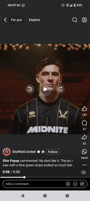
New kit 2025/26
- Thread starter MCRBlade
- Start date
All advertisments are hidden for logged in members, why not log in/register?
Wards
Well-Known Member
That's as good a shirt as we've ever released
PeterNdlovu081
COCK PISS PARTRIDGE
Again, why are the swords so big?
It looks shit and completely ruins the shirt.
It looks shit and completely ruins the shirt.
Millhousesblade1889
Well-Known Member
- Joined
- Jan 12, 2018
- Messages
- 5,407
- Reaction score
- 10,714
One of the best shirts we’ve brought out yet people still moan like their the fashion designer for GucciAgain, why are the swords so big?
It looks shit and completely ruins the shirt.
Greg.
Active Member
- Joined
- Aug 6, 2009
- Messages
- 1,335
- Reaction score
- 2,825
Oh, look! A fucking striped back!!!
I swear gambling sponsors were going to be banned! If I Google W88 I don't even get any results, I think it's like a Thai betting site or something
SufcBilly
Well-Known Member
Stopping talking about the size of my sword I’m very consciousAgain, why are the swords so big?
It looks shit and completely ruins the shirt.
Wards
Well-Known Member
Banned from next season, this is the last year.I swear gambling sponsors were going to be banned! If I Google W88 I don't even get any results, I think it's like a Thai betting site or something
Uncle mick
Member
- Joined
- Oct 30, 2016
- Messages
- 598
- Reaction score
- 1,002
Why do they have to have a video that gives us old uns a epileptic fit flashing everywhere.
Just show the shirt ffs
Just show the shirt ffs
PeterNdlovu081
COCK PISS PARTRIDGE
One of the best shirts we’ve brought out yet people still moan like their the fashion designer for Gucci
Could have been a great shirt if they'd just reduced the size of the badge by about 20%.
Makes it look like a tacky knock off.
Fine margins, eh?
Billyblade
Semi flaccid member
I love our badge so much I wish they'd just put the bloody thing on every shirt instead of the Diet versionAgain, why are the swords so big?
It looks shit and completely ruins the shirt.
Millhousesblade1889
Well-Known Member
- Joined
- Jan 12, 2018
- Messages
- 5,407
- Reaction score
- 10,714
Could have been a great shirt if they'd just reduced the size of the badge by about 20%.
Makes it look like a tacky knock off.
Fine margins, eh?
Last edited:
ChipButtyBlade
Well-Known Member
PeterNdlovu081
COCK PISS PARTRIDGE
I love our badge so much I wish they'd just put the bloody thing on every shirt instead of the Diet version
I don't mind the simplified badge when it's scaled properly.
I've had loads of casual gear from the club shop over the years that looks great because they've done it discreetly.
Obviously you want it to be a bit bigger on an actual shirt but not that fucking big.
It's basic design.
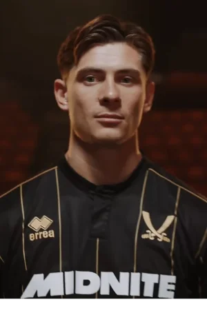
Look at the state of that! It's nearly as big as his face!
sufc323
Active Member
- Joined
- Apr 18, 2017
- Messages
- 1,644
- Reaction score
- 9,295
Very nice kit, the swords as an alternative to the club badge in the past 2 years has been a great addition and credit to Errea for that. Whoever our next supplier is, I hope they continue it.
I don't think anything will top last seasons 3rd shirt though, that really was as bespoke as they come with the addition of the pattern from the Cathedral in the fabric.
I don't think anything will top last seasons 3rd shirt though, that really was as bespoke as they come with the addition of the pattern from the Cathedral in the fabric.
IdLiketoRogerMoore
Has a well-used member
- Joined
- Aug 19, 2016
- Messages
- 8,398
- Reaction score
- 19,461
So our away kit makes us look like Leeds... WTF
What's next? A blue and white stripe third kit?
What's next? A blue and white stripe third kit?
RWE
Member
- Joined
- Feb 23, 2017
- Messages
- 903
- Reaction score
- 2,220
Not bad, not as good as last years 3rd kit mind. Not a huge fan of any of the 3 and this one reminds me of the Kappa skin tight Leeds kit a few years back. I do like the simplified swords on the 3rd kit though. Goalkeeper kit is smart
SwissBlade
Well-Known Member
Lovely shirt, best of the three they’ve released this summer and at first glance it’s probably the best design Errea have done… and then you look at that fucking badge and think why. Why fuck it up when we have a badge for them
They didn’t need to fuck about with the badge design. Make it gold if you want to keep the colour scheme, but don’t change our badge.
They’ve turned a high 9/10 into a 3/10 and it’s now in the bin. Fuckwits
They didn’t need to fuck about with the badge design. Make it gold if you want to keep the colour scheme, but don’t change our badge.
They’ve turned a high 9/10 into a 3/10 and it’s now in the bin. Fuckwits
According to that sizing I need 6xl ,fuck that our lass will piss herself daft !!Need to be careful for the sizing as well, these sizes have to be based on skinny Italians.
XL chest 40 to 42, and XL waist 33 to 35, what the fuck?!
View attachment 216797
kingy1889
New Member
- Joined
- Jan 9, 2018
- Messages
- 92
- Reaction score
- 331
I love the away kit
The home shirt is OK
The third looks nice
I will be buying all 3 for my lad as he loves all 3, bless him. I honestly cannot understand the moaning. It is a simple consumer choice - if you don't like it, don't buy it. So simple.
If you feel hard done to, look at the state of the kit over in S6. It looks like a junior school art project on Windows 95.
DeanLearner'sCat
Active Member
- Joined
- May 18, 2016
- Messages
- 1,659
- Reaction score
- 6,329
Errea really are the kings of the shit collar.
sufc323
Active Member
- Joined
- Apr 18, 2017
- Messages
- 1,644
- Reaction score
- 9,295
Lovely shirt, best of the three they’ve released this summer and at first glance it’s probably the best design Errea have done… and then you look at that fucking badge and think why. Why fuck it up when we have a badge for them
They didn’t need to fuck about with the badge design. Make it gold if you want to keep the colour scheme, but don’t change our badge.
They’ve turned a high 9/10 into a 3/10 and it’s now in the bin. Fuckwits
I like the alternative to the badge. Not to be used all the time, but on 3rd shirts and away shirts it's fine for me, the swords are synonymous with us so it's instantly recognisable as being one of our kits
SwissBlade
Well-Known Member
The one thing they don’t ever need to fuck about with on the shirts is the badge design.I don't mind the simplified badge when it's scaled properly.
I've had loads of casual gear from the club shop over the years that looks great because they've done it discreetly.
Obviously you want it to be a bit bigger on an actual shirt but not that fucking big.
It's basic design.
View attachment 217030
Look at the state of that! It's nearly as big as his face!

SwissBlade
Well-Known Member
The entire badge is the identity. Change it on training wear but not the playing kits. It looks terribleI like the alternative to the badge. Not to be used all the time, but on 3rd shirts and away shirts it's fine for me, the swords are synonymous with us so it's instantly recognisable as being one of our kits
Tickhill Blade
Active Member
- Joined
- Apr 26, 2019
- Messages
- 2,481
- Reaction score
- 7,028
At least they can sew this one on straight. ProbablyLovely shirt, best of the three they’ve released this summer and at first glance it’s probably the best design Errea have done… and then you look at that fucking badge and think why. Why fuck it up when we have a badge for them
They didn’t need to fuck about with the badge design. Make it gold if you want to keep the colour scheme, but don’t change our badge.
They’ve turned a high 9/10 into a 3/10 and it’s now in the bin. Fuckwits
Iffy Onuora's Shiny Head
Active Member
- Joined
- Apr 19, 2016
- Messages
- 1,210
- Reaction score
- 3,365
There was a Journal posted quite a few years ago that Goal Keepers wearing bright coloured Jerseys performed better (let in less goals) than those wearing dark colours.
Announce relegation
Announce relegation
Similar threads
- Replies
- 32
- Views
- 3K
- Replies
- 93
- Views
- 8K
- Replies
- 280
- Views
- 16K
All advertisments are hidden for logged in members, why not log in/register?
