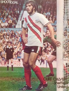
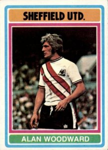
70s Sash Away Shirt

All advertisments are hidden for logged in members, why not log in/register?

Kenilworth

He's one of OUR own
Joined
Aug 6, 2009
Messages
13,786
Reaction score
15,199
Location
Not Kenilworth
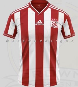
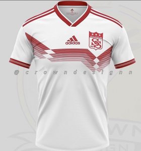
Saw this on Twitter today and it took me back to the 70s.
Who would vote for this being the design for the away shirt next season?
C7B3F914-D6D3-45BE-BFB0-CE2408D68BA1.jpeg
3333EE43-ED77-47F7-A5BB-B7F09CA0DB00.jpeg

the Twitter thread also goes on to talk about the club badge. The Sheffield cost of arms being introduced in 1977 by the then manager Jimmy Sirrel - from a design created 20 years earlier by former player Jimmy Hagan.
Anyone know if this is true?
I’m guessing our resident memory master Silent Blade might provide us some insight.
 

Saw this on Twitter today and it took me back to the 70s.
Who would vote for this being the design for the away shirt next season?
View attachment 69190
View attachment 69191

the Twitter thread also goes on to talk about the club badge. The Sheffield cost of arms being introduced in 1977 by the then manager Jimmy Sirrel - from a design created 20 years earlier by former player Jimmy Hagan.
Anyone know if this is true?
I’m guessing our resident memory master Silent Blade might provide us some insight.
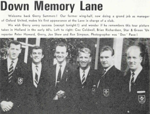
Yes he did for when we played pre or post season tour matches. Here is one when we were on tour in the early 1960s

1579728412382.png
 
Saw this on Twitter today and it took me back to the 70s.
Who would vote for this being the design for the away shirt next season?
View attachment 69190
View attachment 69191

the Twitter thread also goes on to talk about the club badge. The Sheffield cost of arms being introduced in 1977 by the then manager Jimmy Sirrel - from a design created 20 years earlier by former player Jimmy Hagan.
Anyone know if this is true?
I’m guessing our resident memory master Silent Blade might provide us some insight.
Found this from google

The first time a crest appeared on the shirt was actually the 1891-92, when a red crest appeared on the white shirt, but this disappeared the following season. United used the City of Sheffield Arms from 1965-1977, when a new crest was used, introduced by former manager Jimmy Sirrel, but designed apparently over 20 years previously by former player Jimmy Hagan. This consisted of two white crossed swords, or blades, the club's nickname, with a Yorkshire Rose above, on a black background. This is surrounded by a red ring with "Sheffield United F.C." written around the top and "1889", the year the club was founded, underneath. This had been altered very slightly a few times, with a simple black embroidered crest appearing on shirts from 1987-90, and an all-white crest on a red-edged black shield for the 1992-99 seasons, when shields were in fashion with English football clubs, but from 2000-present it has reverted to its original form..
 
Saw this on Twitter today and it took me back to the 70s.
Who would vote for this being the design for the away shirt next season?
View attachment 69190
View attachment 69191

the Twitter thread also goes on to talk about the club badge. The Sheffield cost of arms being introduced in 1977 by the then manager Jimmy Sirrel - from a design created 20 years earlier by former player Jimmy Hagan.
Anyone know if this is true?
I’m guessing our resident memory master Silent Blade might provide us some insight.
Not me.
I'd rather have the 93-95 shirt.
Screenshot_20200122-213505_Google.jpg
 
Found this from google

The first time a crest appeared on the shirt was actually the 1891-92, when a red crest appeared on the white shirt, but this disappeared the following season. United used the City of Sheffield Arms from 1965-1977, when a new crest was used, introduced by former manager Jimmy Sirrel, but designed apparently over 20 years previously by former player Jimmy Hagan. This consisted of two white crossed swords, or blades, the club's nickname, with a Yorkshire Rose above, on a black background. This is surrounded by a red ring with "Sheffield United F.C." written around the top and "1889", the year the club was founded, underneath. This had been altered very slightly a few times, with a simple black embroidered crest appearing on shirts from 1987-90, and an all-white crest on a red-edged black shield for the 1992-99 seasons, when shields were in fashion with English football clubs, but from 2000-present it has reverted to its original form..
HOW DARE YOU GOOGLE OWT!

Visions shattered 😳
 
Found this from google

The first time a crest appeared on the shirt was actually the 1891-92, when a red crest appeared on the white shirt, but this disappeared the following season. United used the City of Sheffield Arms from 1965-1977, when a new crest was used, introduced by former manager Jimmy Sirrel, but designed apparently over 20 years previously by former player Jimmy Hagan. This consisted of two white crossed swords, or blades, the club's nickname, with a Yorkshire Rose above, on a black background. This is surrounded by a red ring with "Sheffield United F.C." written around the top and "1889", the year the club was founded, underneath. This had been altered very slightly a few times, with a simple black embroidered crest appearing on shirts from 1987-90, and an all-white crest on a red-edged black shield for the 1992-99 seasons, when shields were in fashion with English football clubs, but from 2000-present it has reverted to its original form..

My contribution from a thread about it a few years ago

I may be a little wayward on this, but I was informed that the club gave the Hagan design to then shirt manufacturers Admiral, and asked them to come up with some ideas for the new badge. Sirrell was invloved in the final choice from their designs.
 
Saw this on Twitter today and it took me back to the 70s.
Who would vote for this being the design for the away shirt next season?
View attachment 69190
View attachment 69191

the Twitter thread also goes on to talk about the club badge. The Sheffield cost of arms being introduced in 1977 by the then manager Jimmy Sirrel - from a design created 20 years earlier by former player Jimmy Hagan.
Anyone know if this is true?
I’m guessing our resident memory master Silent Blade might provide us some insight.
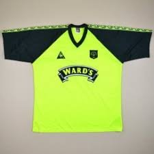
I would fight with my bare hands for that. Best away shirt ever in the history of the club. Even better than the Bassett lime green. Pity we were so shit in it though...
 

Great away kit in the OP but can't we have it with orange sash instead of red ;)

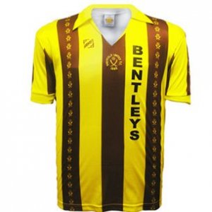
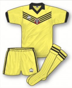
Is the first photo Cliff Calvert on the near post and goalkeeper Jim Grady Brown in the background, and wasn't that the away kit from the dreadful 75-76 rock-bottom relegation season? I liked the one the season after yellow, with the black diagonal lines at the top.

From reading the history books the original design for the current badge was indeed a Hagan original and then picked up by Squirrel in the mid 70s to replace the Sheffield coat of arms badge. And the reason we had to drop the coat of arms? The powers that be in Sheffield took offence at United selling replica shirts with the city's motif on it.
 
The kit is ok but not sure it's practical.

More fussy today so I'd imagine if you're wearing red and white stripes as a home kit, then a white shirt with a thick red sash would still clash in the eyes of those making the decision.
 
Yes he did for when we played pre or post season tour matches. Here is one when we were on tour in the early 1960s

View attachment 69192
Nice to see a photo of the great Peter Howard. Him and Tony Pritchett were the best although I like James Shields. Pritchett was told by the Star that he should go and cover the pigs as they were in a higher division but apparently he told the Sports Editor he was reporting on Sheffield's best. Still they both pale into insignificance with that wizard of reporting Dom, am I saying all the right things?, Howson.
 
Saw this on Twitter today and it took me back to the 70s.
Who would vote for this being the design for the away shirt next season?
View attachment 69190
View attachment 69191

the Twitter thread also goes on to talk about the club badge. The Sheffield cost of arms being introduced in 1977 by the then manager Jimmy Sirrel - from a design created 20 years earlier by former player Jimmy Hagan.
Anyone know if this is true?
I’m guessing our resident memory master Silent Blade might provide us some insight.

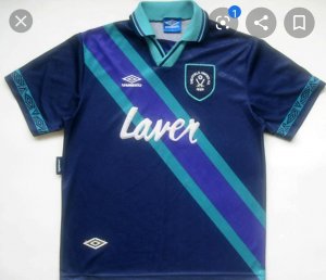
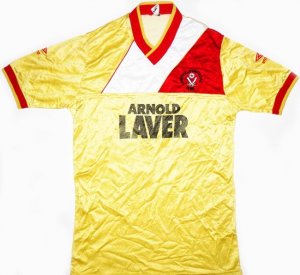
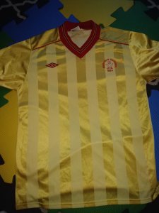
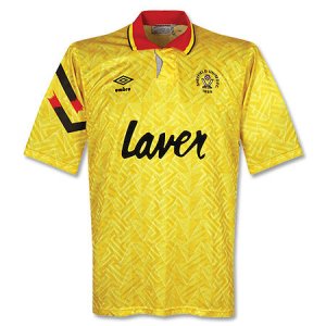
As lovely as that shirt is, I'm longing for a proper Yellow away shirt. Not fluorescent, just proper yellow with red trim..

7cacc752bbae104f32d1437064995277.jpgsheffield-united-away-football-shirt-1982-1986-s_70462_1.jpg450_sheffieldass9092gr8.jpg
 
Nice to see a photo of the great Peter Howard. Him and Tony Pritchett were the best although I like James Shields. Pritchett was told by the Star that he should go and cover the pigs as they were in a higher division but apparently he told the Sports Editor he was reporting on Sheffield's best. Still they both pale into insignificance with that wizard of reporting Dom, am I saying all the right things?, Howson.

I thought Pritchett reported on the Owls at one bit? Before he started reporting on us? I may be wrong.

I remember sending a letter (yep, you write them on paper, put them in an envelope, put a stamp on the envelope and walk down the road to put it in a post box) to "Tell it to Tony" in the Green 'Un. (This feature later became, "In off the post"). I was amazed when the phone rang and it was Tony Pritchett himself! He'd phoned me up to talk to me about the article I'd written. He was an exceptional journalist in his day and I was impressed that he'd bothered to do that.

(Don't any of you buggers start phoning me up about what I write on here though - most of it is bollocks!). ;)
Yes Tony reported on the Owls before the switch over to the Blades in summer 1973 when Peter Howard became the Sports editor.
 
As lovely as that shirt is, I'm longing for a proper Yellow away shirt. Not fluorescent, just proper yellow with red trim..

View attachment 69222View attachment 69223View attachment 69224


Was 91-93 our last proper yellow away shirt? Not counting the 2011/2012 effort which looked slightly brown.

The 70s sash shirt is nice but cant help thinking it would look better with just one block of red as the sash (with a black outline). The two look slightly odd.

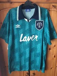
For me our best white away shirts have always been white and black with any red kept to an absolute minimum (and by coincidence have all been 3rd kits)

91-93, 2000-2002 , 2012/13 (3rd) ,2017/18 (3rd).
 
Great away kit in the OP but can't we have it with orange sash instead of red ;)

Is the first photo Cliff Calvert on the near post and goalkeeper Jim Grady Brown in the background, and wasn't that the away kit from the dreadful 75-76 rock-bottom relegation season? I liked the one the season after yellow, with the black diagonal lines at the top.

From reading the history books the original design for the current badge was indeed a Hagan original and then picked up by Squirrel in the mid 70s to replace the Sheffield coat of arms badge. And the reason we had to drop the coat of arms? The powers that be in Sheffield took offence at United selling replica shirts with the city's motif on it.

Sorry for being a pedantic twat Handsworth
But I think it says Cliff Calvert on the photo 😁
Looks like Brown to me though to be fair
 
Was 91-93 our last proper yellow away shirt? Not counting the 2011/2012 effort which looked slightly brown.

The 70s sash shirt is nice but cant help thinking it would look better with just one block of red as the sash (with a black outline). The two look slightly odd.

For me our best white away shirts have always been white and black with any red kept to an absolute minimum (and by coincidence have all been 3rd kits)

91-93, 2000-2002 , 2012/13 (3rd) ,2017/18 (3rd).

I like your thinking crookes
But for me whilst the current kit is getting close
My favourite has always been the classic white away shirt with red collar and cuffs
Thinking late 60s early 70s
Especially the long sleeve version
 
I think we should go for a kit with 2 broad yellow stripes on it. Then it might stop other teams parking the bus.
 

All advertisments are hidden for logged in members, why not log in/register?

All advertisments are hidden for logged in members, why not log in/register?

Back
Top Bottom