Blades Crest Referendum

All advertisments are hidden for logged in members, why not log in/register?

Should We Modify The Current Badge?


  • Total voters
    585
  • Poll closed .


I hate the minimalist badges, they remind me of wank tech startup companies you see see on gofundme. We're a gritty Northern football club not a fucking Silicon Valley software developer
SHFLD
UNTD
1889

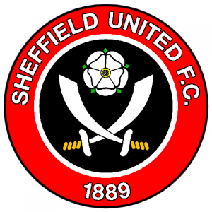
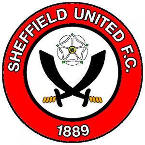
(with some wanky squiggle that's meant to represent a white rose and two crossed cutlasses, but somehow manages to end up looking like a sperm)
 
I love this concept. I think a shield is much more classy and proud.

View attachment 162719
I love the updates to the blades and rose. I think these components replacing the existing rose and blades would be a welcome evolution and improvement on what we have right now.

I might mock it up later to see how it looks
 
Always happy to see the club "develop" new ideas, the changing of our badge would be down at the bottom of the list.
 
I've done some amateur mock-ups (or fuck-ups!) with only the subtlest variations between them. Compared to our official crest I haven't created any real design changes so to speak, just inverted the colours (ones with the white centre circle) with added black outlining so as to make all of the lettering and the crest as a whole stand out a bit more.

Therefore if we were ever to have any changes to our crest my preference would be somewhat along the lines of the 4 I've attached here.

To answer the OP's question of a more minimalist version yes I'd agree but like other posters have mentioned up thread, have such a version on either an alternate, third or anniversary type shirt.
 

Attachments

  • New logo 3.png
    New logo 3.png
    78.6 KB · Views: 16
  • New logo 5.png
    New logo 5.png
    82.1 KB · Views: 15
  • New_logo_9.png
    New_logo_9.png
    81.1 KB · Views: 15
  • New_logo_8.png
    New_logo_8.png
    63.4 KB · Views: 15
I’d replace the white rose with a football. Let’s be honest, what has being part of Yorkshire ever done for Sheffield?


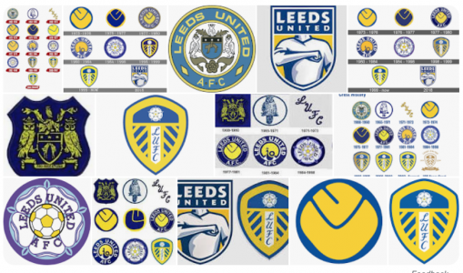
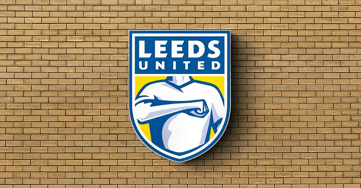
I'd forgotten all about that Leeds United 'elbow shield' rebrand. They got as far as launching it, but the fans hated it so much it was never used

 
Non Blades verdict on our badge, spoilers it's elite.

They were complimentary about our bagde but they also don't have a clue and don't even understand their own opinions, marking some high for being simple and some low for...being simple.
 
True, but we could give the recruitment team some crayons and get them to design one. It'll pass the time on until January.
We could incorporate old father time into the design to reflect our current situation. Carrying two scythes obviously and how about a motto? In Latin of course because it looks posh.
Ponderous, Pashun, Peroni.
Slow and steady wins the game.
Sideways, Backwards, Sideways.
Arthritis R Us.
 
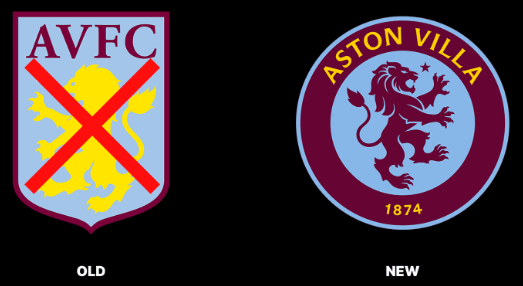
Are the club crests changing a popular thing these days? Looking at the 4 league tables, there's about 7 clubs with crest changes.

Hopefully we stick with ours for the future.
I can’t stand the minimalist one on the away shirts that just has the crossed sea sabres on it. Stick to the best badge in the league, will ya, please?
 
Last edited:
True, but we could give the recruitment team some crayons and get them to design one. It'll pass the time on until January.
We could incorporate old father time into the design to reflect our current situation. Carrying two scythes obviously and how about a motto? In Latin of course because it looks posh.
Ponderous, Pashun, Peroni.
Slow and steady wins the game.
Sideways, Backwards, Sideways.
Arthritis R Us.

Old Father Time? More like the Grim Reaper.
 
True, but we could give the recruitment team some crayons and get them to design one. It'll pass the time on until January.
We could incorporate old father time into the design to reflect our current situation. Carrying two scythes obviously and how about a motto? In Latin of course because it looks posh.
Ponderous, Pashun, Peroni.
Slow and steady wins the game.
Sideways, Backwards, Sideways.
Arthritis R Us.
Why not go the whole hog and have the four horsemen of the apocalypse on our crest.
 
I can’t stand the minimalist one on the shite that just has the cross sea sabres. Stick to the best badge in the league, will ya, please?

I’d say our crest has turned out more naturally minimalist (in a good way).

Not sure you could make it more minimalist. Unless you went crazy like Sheffield FC.


All advertisments are hidden for logged in members, why not log in/register?

All advertisments are hidden for logged in members, why not log in/register?

Back
Top Bottom