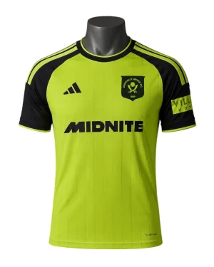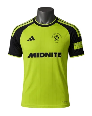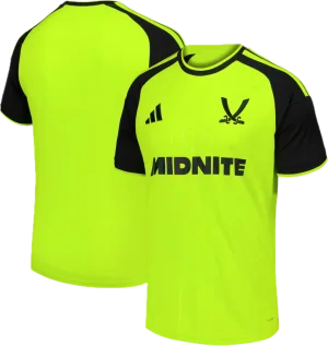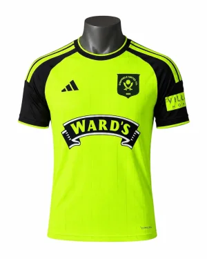
CONFIRMED Next seasons kit

All advertisments are hidden for logged in members, why not log in/register?


It really is sad and shows how far this club has fallen under the chuckle brothers that the most commented thread recently is about the fucking kit.
 
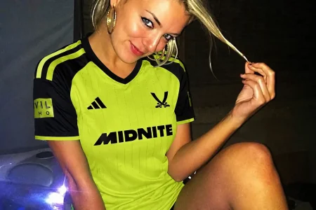
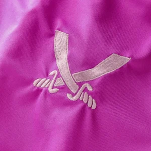
I really like the big swords, to be honest. Cleaner aesthetic.
Would never want it on a home shirt, but I like it on an away.
Dont dislike the big swords as some on here, just feel they have tried to modernise that retro one (which is a nice shirt imo) and they should have gone with the same retro badge/crest. Maybe they should have done same 90s crest but leave the shield out to be more cleaner.

I actually dont mind the kit either (long as its more brighter/luminous colour in person), and it is paired with black shorts and socks.
 
I really like the big blades (not swords) crest.

Baffled why they’d use it with the modern adidas logo though.

Because the cut was diagonal I dont think it would have given sufficient room ie the black would encroach upon the blades which would also have been in black
But I agree it'd have rocked even more with the simplified logo
It could have been in white..?


I quite like it, I don’t even mind the scimitars being used, but at least use the right ones from the proper badge…
 
I love it and thought it’d be universally liked as it’s a proper throwback to 1998 which is one of the most popular away kits that I can remember.

I know it’s each to their own, but if some of the classic kits we’ve had over the years got released for the first time today, we’d have some right meltdowns.

The swords for me are also a nice touch, it’s instantly recognisable as United. I think any smaller and they’d get lost. Adidas have given us 3 very good kits this year, I was worried that we’d get generic crap but it seems like they’ve put a lot of effort into them.
 
If it’s fluorescent - I like it quite a bit. The black sleeves look great and separate it from the 89 and 19 versions while directly linking it to the 98 one.

If it’s not fluorescent then it’s a very disappointing shirt.

I like the big blades badge but that should’ve been with the trefoil. A shield on this one would’ve been a nice one-off.

mattbianco1, the 07 and 15 ones were poor efforts in my opinion as not properly fluorescent - 07 was very dull. 15 was also a big standard adidas teamwear shirt which was a bit shit.


All advertisments are hidden for logged in members, why not log in/register?

All advertisments are hidden for logged in members, why not log in/register?

Back
Top Bottom