
Navigation
Install the app
How to install the app on iOS
Follow along with the video below to see how to install our site as a web app on your home screen.
Note: This feature may not be available in some browsers.
More options
Style variation
You are using an out of date browser. It may not display this or other websites correctly.
You should upgrade or use an alternative browser.
You should upgrade or use an alternative browser.
CONFIRMED Next seasons kit
- Thread starter Donnyblade
- Start date
All advertisments are hidden for logged in members, why not log in/register?


CaptainMorgans
Well-Known Member
- Joined
- Sep 8, 2011
- Messages
- 11,138
- Reaction score
- 30,783
I've bought it. Keen to see it in the flesh but on design alone, it's a 8.5/10 for me.
Almost perfect.
Almost perfect.

Macfarlane21
Active Member
- Joined
- Jun 15, 2009
- Messages
- 1,669
- Reaction score
- 2,510
Got mine off fanatics with 30% off and free delivery with code GOAL

mattbianco1
Forum Royalty
How did you do that?Got mine off fanatics with 30% off and free delivery with code GOAL
I can get either 15% off, OR free delivery. Can only use one code
Macfarlane21
Active Member
- Joined
- Jun 15, 2009
- Messages
- 1,669
- Reaction score
- 2,510
I went on their site at 0900 and it just said £45.5 with the code. Maybe a bit of a glitch? Seems to be gone now unfortunately
How did you do that?
I can get either 15% off, OR free delivery. Can only use one code

sufc323
Active Member
- Joined
- Apr 18, 2017
- Messages
- 1,860
- Reaction score
- 10,438
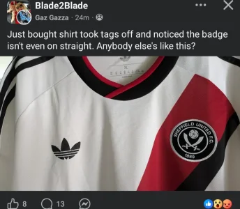
It’s night and day from errea, seems strange too not seeing the United badge at an angle


Berkshire Blade
Well-Known Member
- Joined
- May 11, 2009
- Messages
- 17,221
- Reaction score
- 33,901
It's a winning kit hopefully...that's all I care about
mattbianco1
Forum Royalty
EDIT: - Berkshire Blade put the tweet above.
Club shop is selling WHITE shorts and BLACK socks with it. So kit should look like this (if AI could maintain trefoil on shorts/socks)
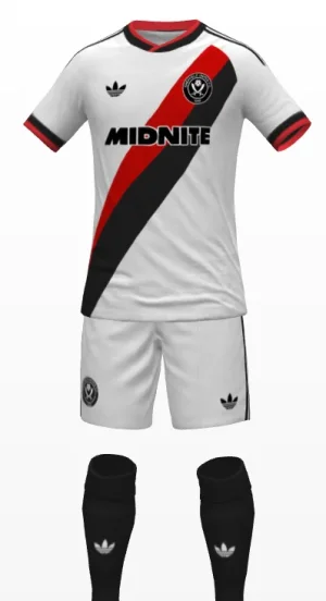
I would guess we have white socks too if required, and the home has red socks
Club shop is selling WHITE shorts and BLACK socks with it. So kit should look like this (if AI could maintain trefoil on shorts/socks)
I would guess we have white socks too if required, and the home has red socks
Dongivensmademecry
Member
- Joined
- Mar 24, 2017
- Messages
- 127
- Reaction score
- 216
Best car park , now best away kit in the league those yanks said be patient
Are they authentic Adidas shirts?Got mine off fanatics with 30% off and free delivery with code GOAL

ZoneManWilf
Woodford Green Blade a long time ago
Looks brilliant with the black socks. I've ordered this morning and not even annoyed I missed that we could get a discount on fanatics...EDIT: - Berkshire Blade put the tweet above.
Club shop is selling WHITE shorts and BLACK socks with it. So kit should look like this (if AI could maintain trefoil on shorts/socks)
View attachment 240415
I would guess we have white socks too if required, and the home has red socks
Macfarlane21
Active Member
- Joined
- Jun 15, 2009
- Messages
- 1,669
- Reaction score
- 2,510
Yes. We have a deal with themAre they authentic Adidas shirts?

Ginger Gnome
Active Member
That's because Adidas are a bunch of cheapskates with no interest in quality like colour matching. Strange how all the brand snobs lap it up just because it's Adidas, where if Errea did the same thing they'd be slated.Yeah thought exactly the same. Suits the shirt. The red on our crest is brighter than the red they’ve used for the sash that’s why it looks busy.
Right call using the one they have imo.
mattbianco1
Forum Royalty
That's because Adidas are a bunch of cheapskates with no interest in quality like colour matching
The second part of that sentence totally contradicts the point you're arguing against.
mattbianco1
Forum Royalty
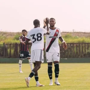
Does the sash go all way round the back though? Thats the key question here or have we got a plain disgusting blank back

mattbianco1
Forum Royalty
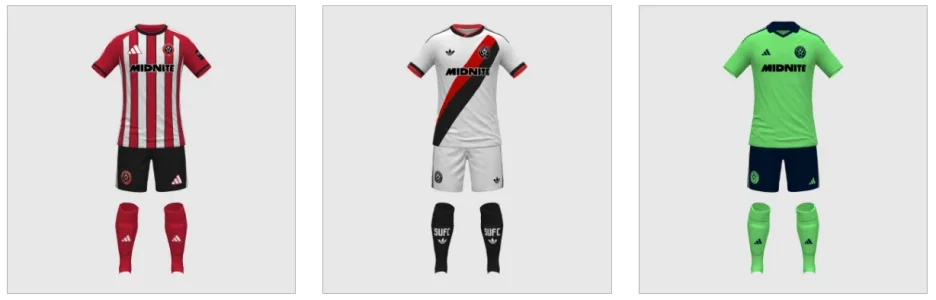
What a trio if the rumoured third is correct

ISZA ⚔️
Well-Known Member
- Joined
- Jan 5, 2021
- Messages
- 4,836
- Reaction score
- 11,245

Chimpan-A
Active Member
- Joined
- Feb 17, 2021
- Messages
- 1,224
- Reaction score
- 3,464
The badge looks great.No it isn't, the monochrome badge is pointless and looks crap. Having a Leeds away shirt for a keeper kit is naff and lazy.
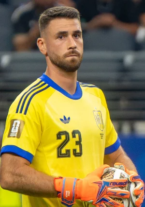
The goalie kit was good enough for Spain the other night, I reckon it’s good enough for us!
mattbianco1
Forum Royalty
The badge looks great.
The goalie kit was good enough for Spain the other night, I reckon it’s good enough for us!
"TWINNED WITH SPAIN..... YOU'LL NEVER SING THAT!"

SwissBlade
Well-Known Member
Having had a second look at the home shirt since we released the away as well, I've decided against it. I much prefer the Trefoil, the modern logo just looks too big.That’s two absolutely class kits. Will be buying both
And whilst i don't care about the players having a striped back, because the solid block helps me see the numbers, I don't think it looks quite right without a number and so I will pass on the home this year. Not massive criticisms but the Away just looks so good that the home just doesn't quite meet the same level
There is a lot of nice training kit though, especially as they again have trefoils on the tshirts and tank tops (for summer padel games)
I was hoping they'd have a pair of training shorts with zip pockets again, i've got a pair of Blades adidas shorts in Blue from the last time and they have just lasted forever.
Negative with the Travel Polos as they have a zip rather than buttons and they don't tend to last the same as buttons
£29.95 delivery and duty to cyprus though so I think i'll wait it out until end of August when i'm back in the UK
My teeny tiny criticism of the away shirt... I do not like the monochrome badge, the normal badge would look better, it's the same colours as the shirt after all...
Also Adidas decision to not include the word Adidas under the logo on ALL of their shirts is crap.
Whoever gets final say on kits at the Lane seem obsessed with changing the colour of our badge of away shirts, especially over recent years.
The first example I remember of our current badge design, was the Orange badge from Le Coq 2004. Horrible badge probably the worst, nice shirt though. The best was probably the green and gold badge from Adidas a few years ago.
But why change it at all?
Is brand recognition not a thing?
I would understand IF our logo was just a pair of Blades crossed, you could change it to any colour and it would look good.
But, we have a circle on our logo, the circle is deliberately red with white text that instantly tells you there is a high possibility this team hails the colours of red and white.
Ok, now imagine we have red and white stripes in the inner cirlce of our badge, not plain black as it is. It was never a black circle just imagine. Then for example the Le Coq orange shirt would have to have orange and black stripes in the badge, which wouldn't make much sense... does anyone see my point?
Just a small criticism.
I get your point, i'm a huge fan of our badge in its standard form on home shirts, but away and training gear i like the monochrome badges. The old Adidas polos with monochromes were great. I think they can also look decent on away shirts as well when the shirt itself is a block of one colour, the badge becomes more subtle. But i think you're right about the monochrome on this away shirt, because the short is white with red and black it lends itself to having the standard badge.
Trefoil on its own without adidas looks good though
Chimpan-A
Active Member
- Joined
- Feb 17, 2021
- Messages
- 1,224
- Reaction score
- 3,464
You could remove “Smo” and replace it with “Marlon” and the warning would still make sense.

mattbianco1
Forum Royalty
I was hoping they'd have a pair of training shorts with zip pockets again, i've got a pair of Blades adidas shorts in Blue from the last time and they have just lasted forever.
These have pockets. Perfect for #padelwankers like us
 we’re skint, but our kit is mint
SwissBlade
Well-Known Member
Cheers! I'd missed the pockets in the pics as I was reading the description and details for the word pocketsThese have pockets. Perfect for #padelwankers like us
And yes indeed for padel wankers


Sportbilly /Detroit Blade
Well-Known Member
- Joined
- Aug 20, 2019
- Messages
- 9,126
- Reaction score
- 14,077
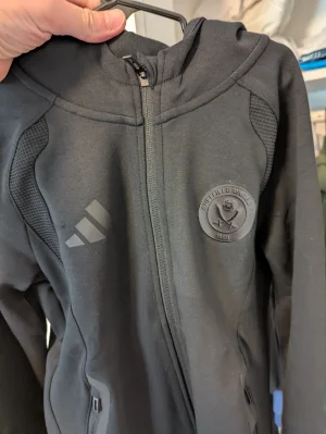
Yes this one but the badge is all black.
Sportbilly /Detroit Blade
Well-Known Member
- Joined
- Aug 20, 2019
- Messages
- 9,126
- Reaction score
- 14,077
Similar threads


All advertisments are hidden for logged in members, why not log in/register?