Swannyblade
Well-Known Member
- Joined
- May 14, 2017
- Messages
- 2,633
- Reaction score
- 7,258
I didn't even know Dee Dee Ramone played footballNew signing could have smiled...View attachment 216614
Follow along with the video below to see how to install our site as a web app on your home screen.
Note: This feature may not be available in some browsers.
All advertisments are hidden for logged in members, why not log in/register?
I didn't even know Dee Dee Ramone played footballNew signing could have smiled...View attachment 216614
I think they’ll be selling iron-on white stripes in the club shop…The red back is the problem. I don't know why we persist with that in so many home shirts. I'll not be buying it. I'll buy the latest retro one if there is another one of those instead.
The front is nice though.
I'd say it's in the top 5 from the last 20 years with these:Don’t get me wrong, should always be a central red stripe, but it’s a welcome change once & again to give something different. Some of the Macron efforts were good, despite resultsMaybe one day we’ll get a central badge and sponsor again…
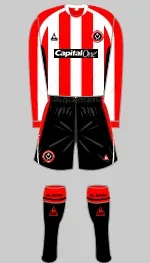
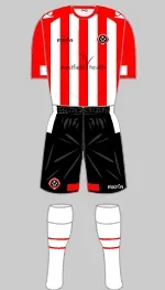
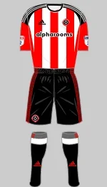
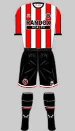
View attachment 216610Not regulation for Stoke by the looks of it. The regulation never existed as far as I can make out.
It's laziness or cheaper to produce without stripes on the back. And it makes it look shite
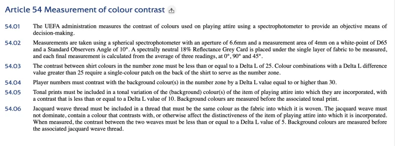
Isn't that UEFA competition specific though?
Isn't that UEFA competition specific though?
And if it's not surely having black numbers on red and white meets the requirements of it having a Delta L value of greater than 30 (no, me neither!)

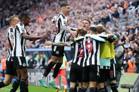

Never understood the hate for a solid coloured back, I much prefer it. I think alot striped back looks cheap and it makes numbers and names difficult to read from a distance for anyone too.Despite being firmly in the black pinstripes camp, I like it. Nice and basic.
Colar is awful though and looks like a bad fit in the pics.
No idea why we’ve gone with a solid red back. It ruins the shirt
A 5/10 but it’s not offensive from the front
I know we've had it before, several times. Always preferred red central. Just looks right.2000-2008 we had a central white stripe every season

I prefer the stripes on the back. But I’d rather we had a white square with black numbers on.Never understood the hate for a solid coloured back, I much prefer it. I think alot striped back looks cheap and it makes numbers and names difficult to read from a distance for anyone too.
Gets a thumbs up from me this shirt, nice and simple, no pin strip and no striped back.
Here's my snap analysis:
PROS CONS Red and white stripes, innit No black pinstripe Quite like that collar, actually Solid red back Nice unobtrusive sponsor Central stripe is white Weird arm detailing
Feels like an attempt at a 'back to basics' kit that gets all the basics wrong. Bang average shirt for me.
They’ll probably go lime green just to throw everyone offSo it looks like black shorts but what about the socks? Surely it's the official launch of the kit not just the shirt,hopefully for me, black socks with a red top.
22/23 Errea was 'ok' design-wise - ruined by the material, the fit and the badge falling off.I'd say it's in the top 5 from the last 20 years with these:
View attachment 216634View attachment 216635View attachment 216636View attachment 216637
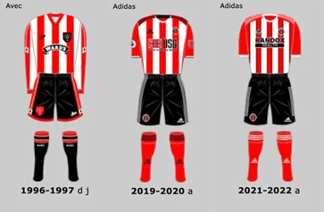
Red central stripe makes red the more dominant colour which feels right. But with the new shirt the plain red at the back will probably balance that out.I know we've had it before, several times. Always preferred red central. Just looks right.
Young Lurch was the thought that sprang to mind.I didn't even know Dee Dee Ramone played football
We play in red and white stripes, solid backs aren't striped so quite easy to see why lots of fans don't like them. Plain backs are normally made from cheap crap, names are impossible to read from a distance anyway, and shirts always look terrible when they look different on one side to the otherNever understood the hate for a solid coloured back, I much prefer it. I think alot striped back looks cheap and it makes numbers and names difficult to read from a distance for anyone too.
Gets a thumbs up from me this shirt, nice and simple, no pin strip and no striped back.
ThisNever understood the hate for a solid coloured back, I much prefer it. I think alot striped back looks cheap and it makes numbers and names difficult to read from a distance for anyone too.
Gets a thumbs up from me this shirt, nice and simple, no pin strip and no striped back.
22/23 Errea was 'ok' design-wise - ruined by the material, the fit and the badge falling off.
And these... Be hard pushed to top the 96/97 for simplistic classic no bullshit red and white striped United shirt. It's borderline perfection.
View attachment 216646
All advertisments are hidden for logged in members, why not log in/register?
