New kit 2025/26

All advertisments are hidden for logged in members, why not log in/register?


It's not bad to be fair.
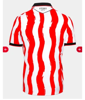
Only gripes are the collar (straight forward black v-neck would have been preferable), a centre-red stripe would have looked better, and plain back panel is annoying but guess it can't be avoided if it's regulation (will look fine with white name/numbers added)
 
It's not the worst Errea kit we have had but minus points for the solid back and even more minus points if we haven't switched back to white socks!!
 
Here's my snap analysis:

PROSCONS
Red and white stripes, innitNo black pinstripe
Quite like that collar, actuallySolid red back
Nice unobtrusive sponsorCentral stripe is white
Weird arm detailing

Feels like an attempt at a 'back to basics' kit that gets all the basics wrong. Bang average shirt for me.
 
Part stripes on the back is so mental as it makes the shirts harder to manufacture 🤯 so you’re making it harder for yourselves and giving fans something they mostly hate.
 
It's not bad to be fair.
Only gripes are the collar (straight forward black v-neck would have been preferable), a centre-red stripe would have looked better, and plain back panel is annoying but guess it can't be avoided if it's regulation (will look fine with white name/numbers added)
Screenshot_20250721-121820.webpNot regulation for Stoke by the looks of it. The regulation never existed as far as I can make out.

It's laziness or cheaper to produce without stripes on the back. And it makes it look shite
 

All advertisments are hidden for logged in members, why not log in/register?

All advertisments are hidden for logged in members, why not log in/register?

Back
Top Bottom