Navigation
Install the app
How to install the app on iOS
Follow along with the video below to see how to install our site as a web app on your home screen.
Note: This feature may not be available in some browsers.
More options
Style variation
You are using an out of date browser. It may not display this or other websites correctly.
You should upgrade or use an alternative browser.
You should upgrade or use an alternative browser.
New kit 2025/26
- Thread starter MCRBlade
- Start date
All advertisments are hidden for logged in members, why not log in/register?
Busta Rhymes Karate
New Member
- Joined
- Feb 15, 2020
- Messages
- 26
- Reaction score
- 155
Midnitetime is the best time of nite.
Ricardo Mantelban
Active Member
- Joined
- Jan 14, 2020
- Messages
- 1,066
- Reaction score
- 1,894
The lesson isYeah, it looks much better on the payers than the release material had it looking
Do not wear in nightclubs. For football use only.
Ginger Gnome
Active Member
Will be interesting to see what colour the cheap knock-offs of this end up compared to the real thing. It looked really pale on some of the launch photos, appears excessively bright on some of the social media posts and looked a bit more dull and muted than it actually is on TV.
DifferentClass
And Forest are a disgusting set of dog fuckers
It seems the promo pics/videos did anything but as the shirt (kit) looks much darker - and better for it - here.
Might be summat to do wi it pissing it down unall.
Jon Bon II
Here's Jonny!
- Joined
- Dec 6, 2016
- Messages
- 10,764
- Reaction score
- 26,028
- Banned
- #608
Watching on the telly, the colour did look darker and not as insipid. However, close up, that front 'swoosh' design and the collar are still beyond awful.
Houston_Blade
Well-Known Member
I remember the same colour shirt in the late 90’s/early 00’s and the Birmingham fans were singing “you’ve got more stewards than fans” to us.Having said, i'm sure it would have been met by 'we'll look like we are about to dig the roads up', by some
MojoMuffin
Active Member
- Joined
- Jul 3, 2023
- Messages
- 938
- Reaction score
- 3,922
Grey Blade
Well-Known Member
- Joined
- Mar 10, 2015
- Messages
- 4,258
- Reaction score
- 8,086
Didn't know anything about any new kit and when I walked into the ground last night I assumed the team warming up in purple were York City. After sitting down and having a closer look I realised it was United. I think any alternative strip should at least have some red, white and black trim - surely?
mattbianco1
Forum Royalty
View attachment 216041View attachment 216042
Warm up kit looks decent, shame about the pissing wonky badge again!
How difficult is it to apply the badges straight?
Last season I went down to have the lucky cat sponsor added to my home shirt that i'd had for about a month. They applied the sponsor and it was wonky, so I ended up getting a brand new shirt out of it.
USELESS!
Sportbilly /Detroit Blade
Well-Known Member
- Joined
- Aug 20, 2019
- Messages
- 7,768
- Reaction score
- 11,695
It seems the promo pics/videos did anything but as the shirt (kit) looks much darker - and better for it - here.
It's just probably the difference in quality from Errea.
We've probably got every shade from wishy washy purple, to purple purple, and every shade in-between.
When you order it's probably a lucky dip what shade you get sent!
Blade58
Once a Blade, always a daft ****
View attachment 216041View attachment 216042
Warm up kit looks decent, shame about the pissing wonky badge again!
Not sure but I think if you lift the shoulders up to where they should be both the blades and Errea badges will straighten up?
Looks to me like it might be more to do with how the shirt is sat on the hanger?
BigBed
All aboard!!
- Joined
- Jun 8, 2016
- Messages
- 15,929
- Reaction score
- 17,126
- Banned
- #617
Or fall off!Not sure but I think if you lift the shoulders up to where they should be both the blades and Errea badges will straighten up?
Looks to me like it might be more to do with how the shirt is sat on the hanger?
DifferentClass
And Forest are a disgusting set of dog fuckers
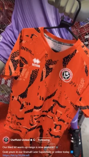
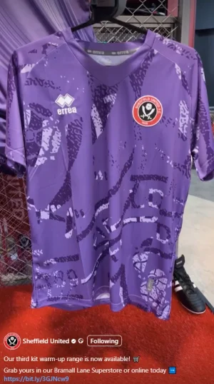
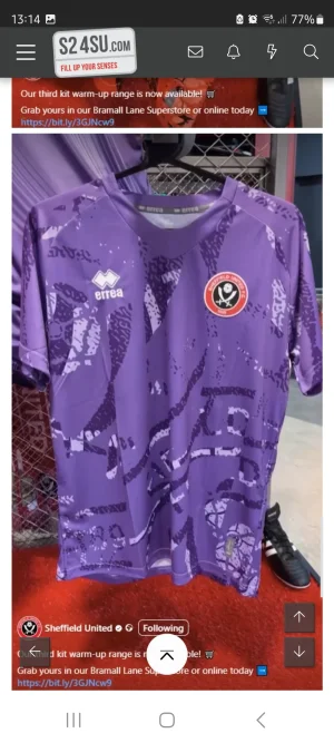
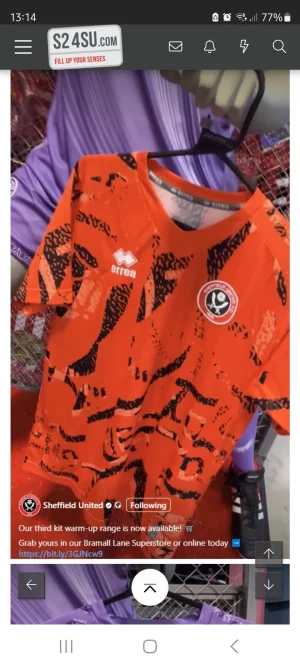
Don't look too bad to me!The new warm up shirts are hideous aswellView attachment 216074View attachment 216075
Sportbilly /Detroit Blade
Well-Known Member
- Joined
- Aug 20, 2019
- Messages
- 7,768
- Reaction score
- 11,695
The orange(?) one looks like that old style Hull City tigers shirt that's run in the wash.The new warm up shirts are hideous aswellView attachment 216074View attachment 216075
BangorBlade
Active Member
- Joined
- Aug 5, 2017
- Messages
- 1,402
- Reaction score
- 1,684
BigBed always wear a dark shirt when going for mealThey've listened to us fat lads, and done shirts that'll hide the dinner we spill down em!
Pollingtonblade
Well-Known Member
Weerz home kit?
Sportbilly /Detroit Blade
Well-Known Member
- Joined
- Aug 20, 2019
- Messages
- 7,768
- Reaction score
- 11,695
Do you eat a giant plate of blueberries for dinner??They've listened to us fat lads, and done shirts that'll hide the dinner we spill down em!
sportinguista
Member
- Joined
- May 29, 2013
- Messages
- 696
- Reaction score
- 1,130
Third kit warm up range? What are we doing here? As with every year, I’m with SouthEssexBlade on this one. Pick a change strip that doesn’t go anywhere close to the home strip and have the two kits. And I’m also with everyone on the Colours and colour blindness thread with this too. I’ve found that a very interesting thread to follow and it’s certainly opened my eyes to something I hadn’t realised was an issue on such a scale. The club/kit designers could think about it and make a thing of it, lead the way on that issue.
Now, if you wanna go out and buy three kits and warm up ranges that’s your right and I have no problem at all with it…but other than rampant marketing does the team on the pitch really need it all? The kit person probably has their own van these days just to get it all to the match.
Now, if you wanna go out and buy three kits and warm up ranges that’s your right and I have no problem at all with it…but other than rampant marketing does the team on the pitch really need it all? The kit person probably has their own van these days just to get it all to the match.
CrookesBlade
Well-Known Member
From what I’ve read about Phil Mills he’d have been rubbing his hands at SUFC throwing a few quid his way to do a photo shoot in the Leadmill.The brands reputation shouldnt matter but it really does, You get youre average every day joe going in the superstore looking for something for his holiday, and if there is a polo shirt with three stripes down the sleeve or an Errea alternative we all know which hes going to walk out the shop with, its just how it is. and with regards to sales the club will have felt that.
Now for my gripe, narratives. pure marketing nonsense and it really is unnecessary and all rather meaningless, and in this instance could be construed as quite crass. Sheffield Institution gets forcibly evicted and Errea uses the dying embers of its name to sell some shirts without giving anything back?
That aside these kits are knocked up, then some marketer and copywriter is tasked with finding some tedious link to some made up narrative.
"Heres your kit, nice init" Is all it needs
Makes McCabe look like Bob Geldof.
Blademan89
Active Member
- Joined
- Feb 21, 2016
- Messages
- 1,688
- Reaction score
- 3,679
Looks like a tram bus/tram seat or any public transport seat for that matter.The new warm up shirts are hideous aswellView attachment 216074View attachment 216075
Similar threads
- Replies
- 32
- Views
- 3K
- Replies
- 93
- Views
- 8K
- Replies
- 280
- Views
- 16K
All advertisments are hidden for logged in members, why not log in/register?


