New kit 2025/26

All advertisments are hidden for logged in members, why not log in/register?

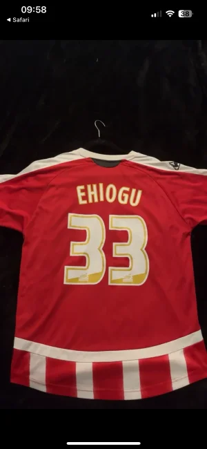
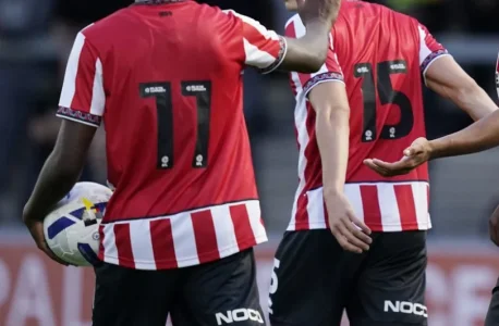
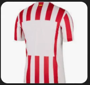
It looks like a red bib has been put over the back of the shirt. It looks terrible and what’s needed is to reintroduce the stripes on the back…Not many will be purchased
 

Phuckin awful home shirt that. Collar is hopeless along with the trims on the sleeves, but that red back deary me that is truly abysmal yes white numbers would make it better but still. What's wrong with stripes on the back with black numbers? Oh and Diaerrea quality on show they can't even sew a badge on straight. I do think some of the away kits have been good but let down by poor quality of the product, very cheap compared to Adidas
 
So no black pinstripes on the shirt, apart from the one at the bottom on the back that makes it look like a bib? Cracking stuff!
 
Looks really nice, until it gets to the back.

It’s like a cut and shut between an Aston Martin and an Austin Allegro…

...brought to you by Crab Autocare.

Great from the front, absolutely abysmal from the rear. Whoever signed off on a plain back wants shooting, I don't care who it is.

It's like my night's out in Leadmill, but the opposite.
 
The solid red back looks exactly the same as every other time we’ve had one since 2005 - don’t know why people are pretending it’s the first time they’ve ever seen the like.

Agreed it looks a bugger with black numbers but that’s easily sorted. I recall end of 05/06 when we wore the new kit for the final game against Palace we played with black numbers which were never seen again.

Kit looks great in my opinion. Bit of an odd collar but I can live with it - similar to the “Teamgeist” Adidas shirts from the 06 World Cup which have made a come back.
 
Don't normally comment on kits as mostly not that fussed.

But this has got to be one of the worst home kits in sometime..the front is dull as dishwasher, and whoever designed the back needs sacking
 
  • Like
Reactions: sam
Sounds like a good idea in principle, but in reality design by committee never ends well. Just look at the consensus in every Kit thread here. You never get people agreeing.

Simple Red and White stripes
Black Pin Stripe
Central Red Stripe
Solid Arms
Too much Black
Stripes are too thin
Stripes are too thick
Why can't we have a central Badge?
Not enough Black
Hummel
Umbro
Adidas
Puma
Errea
Stupid to have a sponsor that you can't put on kids shirts
Technically, it's a Lancashire rose, because it's red
The Shield badge is better
Don't mess with the round badge
White numbers
Needs stripes on the arms
Stripes are too thin, makes it look pink
Solid back 🤮

There's a similar length list just about sponsors. You'd think 'build a website with options for each design feature, let the fans vote, we get what the fans want.' No, you get what some fans want. The same as if you'd not bothered.

Design is a tough gig. Small tweaks, for economic, aesthetic, practical, performance, supply, regulatory, colour conflict reasons can all snowball without careful curation. Like most things, it looks simple, and people only notice the 'mistakes' (to their mind) but overlook the 1000 things that went right to make it happen in the first place.

I quite simply needs White Shirt Printing. It will be fine then

View attachment 216847View attachment 216848
Design by committee could work, we just need MattBianco to make sense of all our ideas and then be part of the Errea -or whoever the next manufacturer is- design team!

100% better with white shirt printing…
 
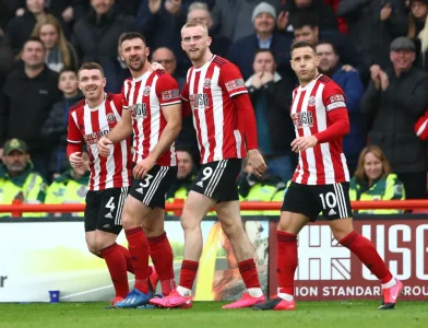
The front of the shirt looks absolutely fine in action for me. I really like it:

Burton Albion 1-2 Sheffield United: Moore Scores Winner With Last Kick of  Game During John Brayford's Testimonial | OneFootball
Burton 1-2 Blades - report
 

I hope the new one doesn’t have “Backdoor Action” on the back like the last one 😮 UTB
 
Yeah, we’ve all seen plain backs on stripey shirts before…But this one looks so bloody awful…Maybe it’s the make shift number and no name, but the full red panel just doesn’t look like it belongs to the shirt.
 
It’s one of those shirts that you look daft walking about in if you haven’t got a name and number on on the back. But, I’m not a twelve year old, so I won’t be buying the name, the number or the shirt…So I guess it’s fingers crossed for the 2nd strip eh. 🤞
 
View attachment 216869

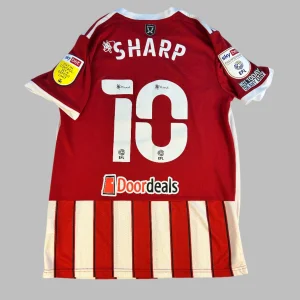
Is it much different to this (colour of numbers aside)?
Just because it looks like another bad shirt doesn't make it good, the fact that people are hoping for a back sponsor to help break up the block of red tells you how bad it is, looks like two entirely different shirts from front and back.

White numbers will make it slightly better but much like the Ramsdens white backed mess (where they never corrected the black numbers to make it red and white) the back ruins what is otherwise a nice looking (from a distance) shirt.

One of the main justifications for swapping from Adidas was that they didn't offer stripes (which wasn't entirely true), but if we're not having stripes anyway, what's the point in bespoke?
 
I feel pretty certain the black numbers were a mistake/necessity for last night only. Can't see them so they won't be allowed in the league.
 
The solid red back looks exactly the same as every other time we’ve had one since 2005 - don’t know why people are pretending it’s the first time they’ve ever seen the like.

Agreed it looks a bugger with black numbers but that’s easily sorted. I recall end of 05/06 when we wore the new kit for the final game against Palace we played with black numbers which were never seen again.

Kit looks great in my opinion. Bit of an odd collar but I can live with it - similar to the “Teamgeist” Adidas shirts from the 06 World Cup which have made a come back.
Two of my favourite United shirts on recent memory had a block red back, and stripes at the bottom - and I'm a stripes on the front and back of the shirt kinda guy...

1753271220838.webp

1000053911.webp

I wonder if part of it comes down to the design and quality with Errea, which of course will be and has been shown to be, worse given that they are a lesser brand.
 
Two of my favourite United shirts on recent memory had a block red back, and stripes at the bottom - and I'm a stripes on the front and back of the shirt kinda guy...

View attachment 216872

View attachment 216871

I wonder if part of it comes down to the design and quality with Errea, which of course will be and has been shown to be, worse given that they are a lesser brand.
Both of those had solid sleeves, somehow the stripey arms make the red block look worse than if they were solid red, even though that doesn't make any sense.
 
Could be total bollocks but I read last night that the plain red back is not the final version and it's supposed to have a stripes on the back. I did wonder whether this had something to with the anticipation of being under Premier League regulations.
Otherway round I think. The standard Errea template has stripes on the back and you can order it via their website (at a slightly higher cost). Not sure where the decision to use the red block or black numbers came from but I can only assume vast quantities of ketamine were involved.
 
Both of those had solid sleeves, somehow the stripey arms make the red block look worse than if they were solid red, even though that doesn't make any sense.
It makes it look like they’re wearing a training bib over the shirt, that’s why it looks worse.
 

Two of my favourite United shirts on recent memory had a block red back, and stripes at the bottom - and I'm a stripes on the front and back of the shirt kinda guy...

View attachment 216872

View attachment 216871

I wonder if part of it comes down to the design and quality with Errea, which of course will be and has been shown to be, worse given that they are a lesser brand.
Going from Adidas to Errea really has been a monumental downgrade in terms of quality and design.
 

All advertisments are hidden for logged in members, why not log in/register?

All advertisments are hidden for logged in members, why not log in/register?

Back
Top Bottom