Navigation
Install the app
How to install the app on iOS
Follow along with the video below to see how to install our site as a web app on your home screen.
Note: This feature may not be available in some browsers.
More options
Style variation
You are using an out of date browser. It may not display this or other websites correctly.
You should upgrade or use an alternative browser.
You should upgrade or use an alternative browser.
Good, bad, alright kit vote
- Thread starter bromtom
- Start date
All advertisments are hidden for logged in members, why not log in/register?
mattbianco1
Forum Royalty
Front is fine. Even the green logo. Would be better in black or red but, hey ho.
I like the white sleeves, it's different from what we've had before.
It's just the fucking back
I like the white sleeves, it's different from what we've had before.
It's just the fucking back
Bashar Al Asaba
Banned
- Joined
- Apr 5, 2018
- Messages
- 2,110
- Reaction score
- 6,145
The first one should read "Absolute rubbish and people should lose their lives" but I went with it anyway.
biggey blade
Member
Front is fine. Even the green logo. Would be better in black or red but, hey ho.
I like the white sleeves, it's different from what we've had before.
It's just the fucking back
I agree the back puts me off I like the rest of it but have a feeling it will look much better on the players once the names and numbers are on the back.
spongebobblade
Well-Known Member
- Joined
- Aug 25, 2013
- Messages
- 3,877
- Reaction score
- 8,004
I’ve voted for absolutely rubbish as I’m currently have a flounce moment
The top looks cheap, very poor design.
Sponsor doesnt look right and should be further away from the club and addidas badge.
I love united, and im always happy to give the club money, but i definitely wont be buying this one - very disappointing.
Sponsor doesnt look right and should be further away from the club and addidas badge.
I love united, and im always happy to give the club money, but i definitely wont be buying this one - very disappointing.
Torrix1889
A reight Bobby Dazzler
It's horrible, compared to any shirt under our agreement with Adidas it is the worst ever...... whoever sanctioned that needs firing.
Truly awful...up side though is that I will save £130 plus as my lads think it is shit as well..
Truly awful...up side though is that I will save £130 plus as my lads think it is shit as well..
mattbianco1
Forum Royalty
Yellarbellyblade
Well-Known Member
If we get promoted in it it’ll be my favourite if we get relegated there should be a symbolic burning of every last fucking one. As neither is that likely, in my opinion, I went for B 
Chris53153
New Member
- Joined
- Nov 10, 2014
- Messages
- 29
- Reaction score
- 52
Booker4
Well-Known Member
- Joined
- Dec 19, 2015
- Messages
- 9,096
- Reaction score
- 13,349
I don't believe people should lose their jobs but I really hope that we re able to make our feelings known to the club and you never know get another made - that is optimistic I know and hundreds will have being made but ultimately that's small fry to both United and Adidas. Does anyone have an idea who that person is? The Superstore manager would be a first guess and maybe from there is can go higher.
CarlMcBlade
Semi active member
Booker4
Well-Known Member
- Joined
- Dec 19, 2015
- Messages
- 9,096
- Reaction score
- 13,349
Adidas. Time to redeem yourselves
No chance mate. It'll be more like this!

Bristol Blade
Member
- Joined
- Aug 13, 2009
- Messages
- 737
- Reaction score
- 2,013
The quality of the shirt looks ok but the plastic sponsor glued on the front looks dire.It's a lot of things mate, but it's far from cheap looking.
View attachment 40986
Its the way the sponsor has been put on that devalues the shirt in my mind. The actual top is fine as such but the sponsor looks rubbish, its looks like one of them nasty iron on efforts that easily peels off in the wash.It's a lot of things mate, but it's far from cheap looking.
View attachment 40986
georgebernardshaw
Well-Known Member
- Joined
- Apr 30, 2012
- Messages
- 15,007
- Reaction score
- 24,910
Had a surplus of white shirts and found a bit of red to chuck on it. As good as the Ajax and diamond designs.
Over to GBS for some outrage.
This shirt is outrageous, it’s outrageously bad and looks outrageously silly - to be honest, it’s so outrageous that my outrage has now reached peakoutrage proportions.
#outraged
Cassius Kray
Subterranean Goat Anarchy
The sponsor looks utterly dire, and the white back is horrible. It's by far the worst kit in recent memory (I actually liked the anniversary one).
SwissBlade
Well-Known Member
I don't like the distinct lack of black stripes, its too white and too genericApart from the plain back which most agree should be striped.
Its not a classic, i'll probably buy it though
Living In a Fantasy World
Warriors Wield Blades
I like the style of the kit, but ruined by the green font and disgusted that we have a plain back, very likely a pass for me.. Shame as I kinda like it.
Ginger Gnome
Active Member
The only good thing with the green is that now both the front and back are runied by horrible green sponsor logos. so that balances it out. The ugly off-white box was crap on the John Holland kits and just as crap now.
It's so bad that in a couple of years they might have many left as they did of the Adkins-era ones.
Simple things like stripes on the back and non-clashing sponsors and this would go from one of the worst ever to one of the best.
It's so bad that in a couple of years they might have many left as they did of the Adkins-era ones.
Simple things like stripes on the back and non-clashing sponsors and this would go from one of the worst ever to one of the best.
broomhillblade
On the move
Red and green should never be seen... except on the dress of an Irish colleen.
(so the saying goes)
(so the saying goes)
Patrick Suffaux
Well-Known Member
+
Stripe widths/ratio is perfect
-
Too much white, not enough red
Green shirt sponsor font looks awful
Sleeves should be solid red
Don’t like the back
Overall Summary:- Not good. We’ve had worse but it’s down there with some of the worst. I think saying people should lose their jobs is a little extreme so I’m not voting. It is shite though and has clearly been designed by someone who has no idea about the image and identity of Sheffield United. Won’t be buying it.
benn5712
Usually wrong,reyt enough.
- Joined
- Aug 3, 2017
- Messages
- 4,750
- Reaction score
- 5,779
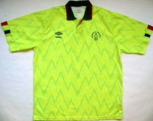
International Rescue/Thunderbirds shirt from the 90's. No, no, please no!The thing that annoys me the most is we've had two great kits over the last two seasons... and now this horrible thing! Lets hope the away kit makes up for this poor effort.
bromtom
Well-Known Member/ Former F1 Driver Jos Verstappen
- Thread starter
- #28
+
Stripe widths/ratio is perfect
-
Too much white, not enough red
Green shirt sponsor font looks awful
Sleeves should be solid red
Don’t like the back
Overall Summary:- Not good. We’ve had worse but it’s down there with some of the worst. I think saying people should lose their jobs is a little extreme so I’m not voting. It is shite though and has clearly been designed by someone who has no idea about the image and identity of Sheffield United. Won’t be buying it.
I'm just going on some of the posts on here when I say lose their jobs. That's the level of anger I've judged it at for those that don't like it.
DeanLearner'sCat
Active Member
- Joined
- May 18, 2016
- Messages
- 1,638
- Reaction score
- 6,111
The front is good (except for the green sponsor), the back is unacceptable.
Granada Blade
New Member
- Joined
- Jul 31, 2016
- Messages
- 78
- Reaction score
- 156
It's such a fucking shockingly shit shirt.
Similar threads
- Replies
- 25
- Views
- 1K
- Poll
- Replies
- 159
- Views
- 8K
- Replies
- 15
- Views
- 1K
- Replies
- 9
- Views
- 603
All advertisments are hidden for logged in members, why not log in/register?


