Navigation
Install the app
How to install the app on iOS
Follow along with the video below to see how to install our site as a web app on your home screen.
Note: This feature may not be available in some browsers.
More options
Style variation
You are using an out of date browser. It may not display this or other websites correctly.
You should upgrade or use an alternative browser.
You should upgrade or use an alternative browser.
New kit 2025/26
- Thread starter MCRBlade
- Start date
All advertisments are hidden for logged in members, why not log in/register?
Jon Bon II
Here's Jonny!
- Joined
- Dec 6, 2016
- Messages
- 10,764
- Reaction score
- 26,028
- Banned
- #1,202
Phew, thank god for that then. I couldn't see the numbers properly against Burton, so I didn't know if it was Peck, Grbic or O'Hare that scored the winner. Having names and numbers visible from the ISS will enhance my match day experience so much.
CrookesBlade
Well-Known Member
It’s almost like design and personal taste are completely subjective.
I do wonder what people would have said on the internet at the time re some of the classic kits of the early 90s.
I do wonder what people would have said on the internet at the time re some of the classic kits of the early 90s.
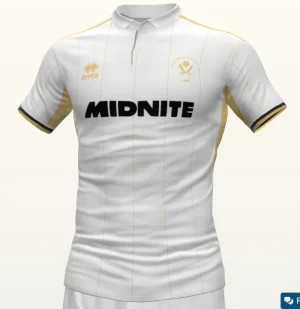
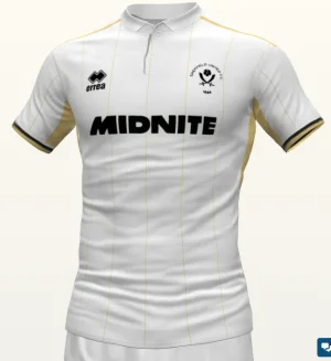
I like just the swords badge on an away or third, people just like to moan for the sake of moaning! Granted, entitled to do so...Fixed the badge.
View attachment 217068
I think the print would all look better in Black though to match the sponsor
View attachment 217066
I do like the badge and Errea logo in black, matching sponsor though.
But, mattbianco1 - create a portfolio of kit designs and apply for a job with the next kit manufacture, or see if fan advisory board can submit your designs - please & thank you!
sufc323
Active Member
- Joined
- Apr 18, 2017
- Messages
- 1,643
- Reaction score
- 9,291
It's criminal how that limited edition home shirt never made it as an actual home shirt, it would have been an all timer regardless of brand
BerksBlade
Behind the white railings
ISZA ⚔️
Well-Known Member
- Joined
- Jan 5, 2021
- Messages
- 4,419
- Reaction score
- 10,210
If I can get a 5XL without the sponsor on I’m gonna use it to replace the back on a mediumWTF is this? Can't deliver 10 outfield shirts that look the same. errea really are rubbish, aren't they?
View attachment 217073
You know what, whilst this is embarrassing - the difference in back of shirts. I actually think the number 28's is nicest, with the stripes being higher up and the red back being reduced.WTF is this? Can't deliver 10 outfield shirts that look the same. errea really are rubbish, aren't they?
View attachment 217073
CrookesBlade
Well-Known Member
unitedbhoy
Member
Absolutely belting away shirts
BerksBlade
Behind the white railings
I agree, but the name & number are printed too low.You know what, whilst this is embarrassing - the difference in back of shirts. I actually think the number 28's is nicest, with the stripes being higher up and the red back being reduced.
Davalon
Animo et fide
- Joined
- Jan 7, 2017
- Messages
- 19,035
- Reaction score
- 34,847
Decent enough kits for me this season. None of us will always love our new kits but for me, as long as I don't hate them I'm happy enough.
The inconsistency of the back of the women's shirts looks tin pot though, sad to say.
Also, why are Ty and Coops wearing slacks with their shirts
The inconsistency of the back of the women's shirts looks tin pot though, sad to say.
Also, why are Ty and Coops wearing slacks with their shirts
S5Blade
Nom, Nom, Nom
Phew, thank god for that then. I couldn't see the numbers properly against Burton, so I didn't know if it was Peck, Grbic or O'Hare that scored the winner. Having names and numbers visible from the ISS will enhance my match day experience so much.
This may shock you, but, there are other fans and other people where this kind of stuff IS important. I get you are upset that the club are not pandering to your individual needs but, in the grand scheme of things, it literally makes fuck all difference to you does it, but it does to others, so surely thats a good thing, no?
Shadota
"Nighttime is the best time of night"
That away kit is very nice. GK shirt also is well tidy. Shame about the back of the home shirt being a downer, but we've had far worse in years gone by than this set of kits.
Tickhill Blade
Active Member
- Joined
- Apr 26, 2019
- Messages
- 2,480
- Reaction score
- 7,027
Christ, the shirt looks even worse side-on than it does from the backWTF is this? Can't deliver 10 outfield shirts that look the same. errea really are rubbish, aren't they?
View attachment 217073
mattbianco1
Forum Royalty
Someone on Twitter needs to tag in the Blades Advisory Board and tell them that whilst they're at it, to make sure all the backs match.
Di-Errea need to quickly fuck off
RWE
Member
- Joined
- Feb 23, 2017
- Messages
- 903
- Reaction score
- 2,220
Holy fuck, worse than Primark. How are they still getting contracts with football clubs? Never known a brand so poor in the majority of designs but the quality is genuinely worse than Sunday league. I actually think the DH Gate stuff is better quality than the real kit from my own experience which is laughable.
RammyBlade
We are Bladesmen,Super Bladesmen from the Lane,
- Joined
- Dec 27, 2013
- Messages
- 1,948
- Reaction score
- 2,248
The back of the shirt is just garbage !Front is good thoughWTF is this? Can't deliver 10 outfield shirts that look the same. errea really are rubbish, aren't they?
View attachment 217073
Fjortoft's Aeroplane
Active Member
- Joined
- Aug 20, 2015
- Messages
- 2,246
- Reaction score
- 3,610
Will they let you have the away keeper top without the sponsor?
metalblade
Well-Known Member
- Joined
- Sep 6, 2005
- Messages
- 16,067
- Reaction score
- 24,226
I like the away shirts, told ya less is more sometimes.
Jon Bon II
Here's Jonny!
- Joined
- Dec 6, 2016
- Messages
- 10,764
- Reaction score
- 26,028
- Banned
- #1,225
So are you saying that Blades fans can't tell the difference between Kieffer Moore and Sydie Peck, and need to be able to see the names and numbers on the back in order to do so? How many times have you been able to pick out names and numbers on the backs of shirts from your lofty position in the stands? Maybe the first few rows can see them but anyone higher, probably just a number at best. I suggest that if you're so visually impaired that you can't tell the difference between Moore, Peck and Sereki without looking at the backs of their shirts, that no colour or variation of shirt design and name/number is going to be of any help whatsoever.This may shock you, but, there are other fans and other people where this kind of stuff IS important. I get you are upset that the club are not pandering to your individual needs but, in the grand scheme of things, it literally makes fuck all difference to you does it, but it does to others, so surely thats a good thing, no?
S5Blade
Nom, Nom, Nom
Some might not be able to? That's the whole point, just because you and I can, doesn't represent every member of the fan base. Is this really that complicated to understand?So are you saying that Blades fans can't tell the difference between Kieffer Moore and Sydie Peck, and need to be able to see the names and numbers on the back in order to do so? How many times have you been able to pick out names and numbers on the backs of shirts from your lofty position in the stands? Maybe the first few rows can see them but anyone higher, probably just a number at best. I suggest that if you're so visually impaired that you can't tell the difference between Moore, Peck and Sereki without looking at the backs of their shirts, that no colour or variation of shirt design and name/number is going to be of any help whatsoever.
Jon Bon II
Here's Jonny!
- Joined
- Dec 6, 2016
- Messages
- 10,764
- Reaction score
- 26,028
- Banned
- #1,227
Please refer to my last sentence, repeated here for the hard of understanding.Some might not be able to? That's the whole point, just because you and I can, doesn't represent every member of the fan base. Is this really that complicated to understand?
'I suggest that, if you're so visually impaired that you can't tell the difference between Moore, Peck and Sereki without looking at the backs of their shirts, that no colour or variation of shirt design and name/number is going to be of any help whatsoever.'
Tell me again how having a plain back is going to help such people?
FTPE
Well-Known Member
- Joined
- Jul 9, 2014
- Messages
- 10,298
- Reaction score
- 19,179
I don't think the sponsor spoils this one at all if I'm hoesnt.These are lovelyIf the option to buy without sponsor is available, will get both!
I have never wanted a goalie shirt more…
Why have such a large area of the shirt taken up then by the red mass. Surely a smaller white patch in the middle of visible stripes would suffice. Its not a good look and it looks like we are playing in a full red shirt with no stripes from the back.That's the refs happy then !!
KMC-1889
Active Member
- Joined
- Jul 3, 2025
- Messages
- 1,628
- Reaction score
- 4,734
Imagine the fall out from seeing the collar with laces in for the first time.It’s almost like design and personal taste are completely subjective.
I do wonder what people would have said on the internet at the time re some of the classic kits of the early 90s.
Similar threads
- Replies
- 32
- Views
- 3K
- Replies
- 93
- Views
- 8K
- Replies
- 280
- Views
- 16K
All advertisments are hidden for logged in members, why not log in/register?


