mattbianco1
Forum Royalty
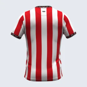
It can't be. The back is red.Think that’s the back of the shirt you mistaking it for.
Follow along with the video below to see how to install our site as a web app on your home screen.
Note: This feature may not be available in some browsers.
All advertisments are hidden for logged in members, why not log in/register?
It can't be. The back is red.Think that’s the back of the shirt you mistaking it for.
Hmm. But it’ll probably be printed/sublimated red and if so still white on the inside.It can't be. The back is red.

I think I'm in the minority here but not really a fan of the home shirt at all. I know we all have favourite designs (and I think it depends on what era we grew up in) but without the black pinstripe the shirt just looks wrong to me and this effort just comes across as a bit boring imo. I also think the stripes are way too thin and it all feels a bit 'meh'. I do think the black sponsor, collar and cuffs look good (and the shirt really needs them). I don't hate it and maybe it'll grow on me when I see it in person but 5/10 so far. You'll never beat 1992-93 (laces) or 2017-18 for me. Just perfect:
View attachment 216720
Goes to show, doesn’t it? Because I never liked that one. Too much black. Not a fan of side panels or shoulder sections or flashes in other colours. Just give us red and white stripes, damn it.2017-18 easily the best of the last 25 years. God tier shirt.
Here’s another con £72.30
Counterpoint: One of my favourite ever photos of that kit is of my son, then a toddler, laughing his arse off in full kit on Bouncing Day as we watched the match together on telly.
Damn right
Goes to show, doesn’t it? Because I never liked that one. Too much black. Not a fan of side panels or shoulder sections or flashes in other colours. Just give us red and white stripes, damn it.

I have a similar pic of my daughter in the Nigel Adkins home kit.Counterpoint: One of my favourite ever photos of that kit is of my son, then a toddler, laughing his arse off in full kit on Bouncing Day as we watched the match together on telly.
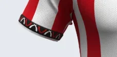
The sleeve cuffs aren't even the samehttps://www.errea.com/uk_en/sheffield-united-fc-home-shirt-mc-ad-25-26-smtw6c04350she.html
View attachment 216742
Yeah, but the Errea website has given it a striped back…


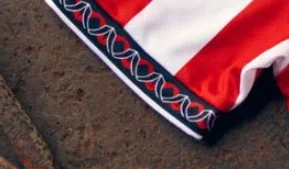
I think it’s odd that the collar and cuffs don’t match. I haven’t really liked any Errea home shirt that much. I really liked the Adidas kit we had the first season back in the Prem, and then the first one back in the Championship.
Prefer the top sleeve embellishments
The one on the Errea site is much better than what we've got, the real sleeve trim looks like what happens to the badge when AI has a go at designing a shirt.
The worrying this is this was one of the media samples selected due to its high quality (you'd imagine).The sizes of the circled white stripes marked here don't match up.
View attachment 216714
The Errea logo is also not centred within the white stripe it inhabits.
That’s my favourite also. Was such a smart but simplistic kit. And it looked great with white shorts and socks as a alternate away kit (wish we did this more)I think I'm in the minority here but not really a fan of the home shirt at all. I know we all have favourite designs (and I think it depends on what era we grew up in) but without the black pinstripe the shirt just looks wrong to me and this effort just comes across as a bit boring imo. I also think the stripes are way too thin and it all feels a bit 'meh'. I do think the black sponsor, collar and cuffs look good (and the shirt really needs them). I don't hate it and maybe it'll grow on me when I see it in person but 5/10 so far. You'll never beat 1992-93 (laces) or 2017-18 for me. Just perfect:
View attachment 216720

I’d say that confirms the white and gold away kit.
All advertisments are hidden for logged in members, why not log in/register?
