Deadbat
Well-Known Member
- Joined
- Aug 6, 2009
- Messages
- 6,607
- Reaction score
- 39,206
Just been down to the shop to buy a shirt for the lad (I buy mine when they sell then at discount prices at the end of the season) so my thoughts now on seeing both shirts in person.....
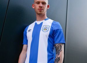
Home - Looks good from the front. Good thickness of stripes / right number and dont mind the white on the breast/shoulders and on the front. It seems different to what we have had before at least. I like the v neck and the sleeves are quite innovative. The back looks wrong and seeing the red numbers/names up close they don't look great to me. I thought I'd like the red but it does not work. The red on tbe stripes is very light. When I held up a shirt it almost looked dark orange. There are lots of pixels in the stripes (looks like minecraft and dare I say it a bit like SWFCs shirt of last and thus season but lots of clubs doing this with stripes). The kids sponsor sadly looks awful on both shirts and looks cheap. The material does seem quite thin. Great for the players but I worry after countless washes from ordinary fans whether it will last. It's an ok shirt but one of our poorer homes from Adidas. In recent years I preferred last year and 17-18 to it.
6.5/10
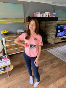
Away - I was somewhere in the middle of loving it and hating it. I know it seems you have to go one way or the other these days but I was on the fence. I like pink as a colour and this shade is ok but maybe I think lighter may have worked more if we want to wear it away from home... as it stands we will hardly wear it.
Seeing it up close and it has the wow factor with the colour alone and does look better in person from a distance. The blotchy pattern does not look so good when you get close up. The rest of the shirt is quite plain but then the colour of it; you would expect that. It's already been done quite a bit in recent years by Juventus, Man Utd and Leicester all by the same company so it's not original in that sense but original for us....I like us trying something we have not before. I love the shorts actually and they work well. Do wonder if they could have incorporated more silver into the shirt rather than Black? Apparently it's flying out of the shop and they won't have many left soon but surely they just order more stock if demand is there? A lot more were buying this than the home but that's been out a bit longer. Looking at them side by side and we simply won't be able to wear it v red teams. It's too similiar so seems a bit of a pointless kit from a practical sense but it's gimmicky and will sell a load so SUFC will say that's the justification for having it. Be interesting to see what colour the third (let's be honest away really) will be. We have done lime and white so I would not be adverse to the same kit inverse...be controversial but silver/grey short with pink shorts! Failing that a dark moody black with lime/red trim be nice? As for the pink it certainly stands out. It's a nice shirt but not sure I see it as a SUFC away and the fact it's basically a knock off from Leicester/ Man Utd is a bit lazy from Adidas.
7/10


