Navigation
Install the app
How to install the app on iOS
Follow along with the video below to see how to install our site as a web app on your home screen.
Note: This feature may not be available in some browsers.
More options
Style variation
You are using an out of date browser. It may not display this or other websites correctly.
You should upgrade or use an alternative browser.
You should upgrade or use an alternative browser.
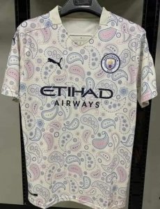
These are them - New Kits 20/21 - 'leak'
- Thread starter Rollerball
- Start date
All advertisments are hidden for logged in members, why not log in/register?
SouthEssexBlade
...for wit and sage wisdom
so if the away shirt was blue and white you’d be happy? It’s a football shirt and it’s a colour? The fact is that pink has ramifications and as childish as it is (we’re all big kids when it comes to football) this is linked to pigs. Pink should be avoided at all costs and whoever sanctioned this obviously has no idea of the city rivalry.
Given how things are at the moment with the Grubbies this has a dark appeal, in a few years time kids football quizzes would get interesting.
Which team in Sheffield play in blue?
A: Sheffield United away from home.
HermitageBlade
Member
- Joined
- Feb 3, 2016
- Messages
- 269
- Reaction score
- 385
Well no because that's stupid, but your navy blue desun one was a classic
Mate, grow up
I’ve just had a look at that one and I honestly can’t remember it so not that much of a classic. It was hardly the same blue either so to be fair I don’t think we can compare it.
We’ve had loads of kits over the years some better than others and that is all subjective. As I said though this to me is different and really wasn’t thought through.
It’s football mate, we don’t grow up that’s why I’m on a forum at 10am on a Monday morning discussing my teams kit.
Chabuddy G
Kurupt FM
- Joined
- Jun 12, 2020
- Messages
- 2,755
- Reaction score
- 5,383
- Banned
- #995
I disagree, but have a laugh reaction for that last comment alone. Good point.I’ve just had a look at that one and I honestly can’t remember it so not that much of a classic. It was hardly the same blue either so to be fair I don’t think we can compare it.
We’ve had loads of kits over the years some better than others and that is all subjective. As I said though this to me is different and really wasn’t thought through.
It’s football mate, we don’t grow up that’s why I’m on a forum at 10am on a Monday morning discussing my teams kit.
hull-Blade
Bladester
- Joined
- Apr 20, 2019
- Messages
- 1,663
- Reaction score
- 1,597
Not overly impressed but each to their own .
Anyone know when the training gear may appear?
Anyone know when the training gear may appear?
Birley Blade
Moaner
- Banned
- #997
Surely there’s gonna be a huge drop in sales this year, Adidas really have took the piss.
Balham
S24SU Seer
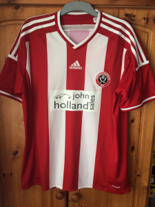
Adidas's away shirts for us have been relatively decent. Certainly on a par with the home shirts.
14/15
Home 3/10. The H shirt. Afterthought sponsor in off-white; central Adidas tribar, United badge virtually in the armpit. Saved only by the shade of red and stripe widths.
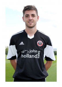
Away 5/10. Inoffensive but a bit Sunday League
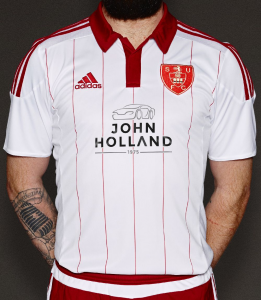
15/16
Home 8/10 (without sponsor)/ 5/10 (with sponsor). If you're going to do a commemerative shirt, don't put a tinpot sponsor's logo on it. I partly like it because of how angry it makes people..."waaaaaaah it's not a Sheffield United shirt"...I'd refer you to the below - maybe we should have paired it with navy blue shorts?
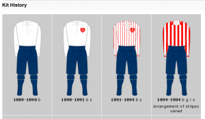
Away 4/10. Quite why we keep trying to recapture the glory of the 89-91 Umbro effort is beyond me as nothing has come close
16/17
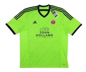
9/10. Borderline perfection.
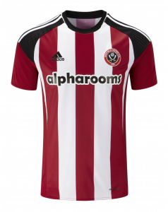
6/10. Would have been 9/10 had the detailing been in red rather than orange. Sponsor's colourscheme clashes.
17/18
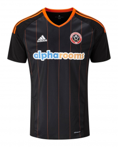
Home 9/10. Arguably too much black but it just works and it'll always be remembered for Bouncing Day.

8/10. Is it blue, is it purple (it's purple). Solid kit, nothing flashy and the sponsor fits in nicely
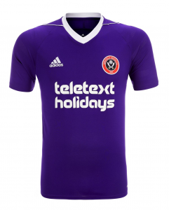
17/18 third (worn a couple of times)
8/10: same as above, understated with the sponsor fitting in
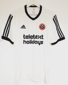
18/19
Home 5/10. Green sponsor clashes; plain white back just doesn't work for me.
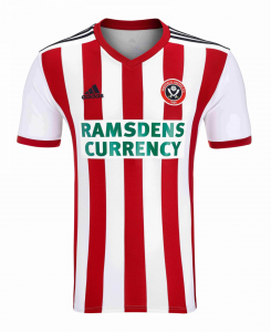
Away 5/10. Better than the 15/16 effort but still fails the 89-91 comparison
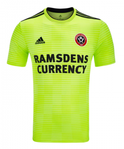
19/20
Home 7/10. Not sure about the big red block on the back and the sponsor should be all black.

Away 7/10. Decent effort - not least because the USG logo doesn't look horrendous
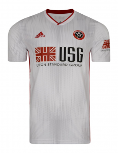
19/20 third: same as 18/19 but with USG logo
20/21
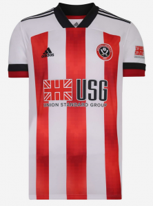
Home 6/10. Lots of white; presume the pixellation on the red stripes is to make it more difficult to counterfeit?
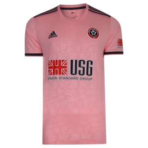
Away 8/10. I love the colour but the USG logo clashes - particularly the red.
14/15
Home 3/10. The H shirt. Afterthought sponsor in off-white; central Adidas tribar, United badge virtually in the armpit. Saved only by the shade of red and stripe widths.

Away 5/10. Inoffensive but a bit Sunday League

15/16
Home 8/10 (without sponsor)/ 5/10 (with sponsor). If you're going to do a commemerative shirt, don't put a tinpot sponsor's logo on it. I partly like it because of how angry it makes people..."waaaaaaah it's not a Sheffield United shirt"...I'd refer you to the below - maybe we should have paired it with navy blue shorts?


Away 4/10. Quite why we keep trying to recapture the glory of the 89-91 Umbro effort is beyond me as nothing has come close

16/17
9/10. Borderline perfection.

6/10. Would have been 9/10 had the detailing been in red rather than orange. Sponsor's colourscheme clashes.

17/18
Home 9/10. Arguably too much black but it just works and it'll always be remembered for Bouncing Day.

8/10. Is it blue, is it purple (it's purple). Solid kit, nothing flashy and the sponsor fits in nicely

17/18 third (worn a couple of times)
8/10: same as above, understated with the sponsor fitting in

18/19
Home 5/10. Green sponsor clashes; plain white back just doesn't work for me.

Away 5/10. Better than the 15/16 effort but still fails the 89-91 comparison

19/20
Home 7/10. Not sure about the big red block on the back and the sponsor should be all black.

Away 7/10. Decent effort - not least because the USG logo doesn't look horrendous

19/20 third: same as 18/19 but with USG logo
20/21
Home 6/10. Lots of white; presume the pixellation on the red stripes is to make it more difficult to counterfeit?

Away 8/10. I love the colour but the USG logo clashes - particularly the red.

LoughboroBlade
Well-Known Member
Niceguyeddie
Well-Known Member
- Joined
- Apr 22, 2019
- Messages
- 4,965
- Reaction score
- 8,070
- Banned
- #1,001
What is the footballing culture of this city with regards to pink kits ?Well that confirms it then...
Our best kit this season is the goalie kit.
It might be a modern twist, but if you're Adidas you can't do your homework on the footballing culture of this city and the proceed to kit either side out in pink.
Swannyblade
Well-Known Member
- Joined
- May 14, 2017
- Messages
- 2,633
- Reaction score
- 7,258
Roygbiv
Well-Known Member
What is the footballing culture of this city with regards to pink kits ?
Wednesday fans apparently call us pigs because we wear red and white. BAN RED AND WHITE
Niceguyeddie
Well-Known Member
- Joined
- Apr 22, 2019
- Messages
- 4,965
- Reaction score
- 8,070
- Banned
- #1,004
Its so sadWednesday fans apparently call us pigs because we wear red and white. BAN RED AND WHITE
Really really sad
Well, we had to put a dampener on the season at some point I suppose. It's the Blades way.
I thought it was going to be a sort of beige type pink, that's how it seemed in the previous photos.
These 2 kits are the worst since the 2015/16 season anniversary shirts. Time to get rid of Adidas now.
Umbro or New Balance next for me.
I share your views on getting a new kit supplier next year. Not a fan of Adidas and we need full stripes on the back of shirts again. As for the away shirt it looks better than the salmon pink versions previously distributed IMO. As I've already pointed to her sides legion of pig relatives who are already texting me its a unique marketing ploy designing a shirt that embodies our core colours of red and white. I've also congratulated them on their away shirt which brings together rust and shit
Chabuddy G
Kurupt FM
- Joined
- Jun 12, 2020
- Messages
- 2,755
- Reaction score
- 5,383
- Banned
- #1,006
Adidas don’t just supply us kits and go ‘here these are your kits’Well that confirms it then...
Our best kit this season is the goalie kit.
It might be a modern twist, but if you're Adidas you can't do your homework on the footballing culture of this city and the proceed to kit either side out in pink.
We tell them what colours we want and they send us several templates to choose from
Steven Bettis wanted pink
WestSiberiaBlade
Member
- Joined
- Jul 16, 2019
- Messages
- 176
- Reaction score
- 127
- Banned
- #1,007
It's totally homophopic to suggest that people would be put off of this shirt because they're homophobic. I mean, I'm super gay, and me and my mate think that this monstrosity of a shirt is for little girls and fairies. Can we please have a black third kit, with a leathery feeling and looks to it? Preferably with spikes, too. Ideas for the design are most welcome.
It’s a difficult one this year. The additional poundage gained while drinking in garden during lock down means the stripes on the home shirt will come across convex. Or a pink away shirt with from a distance al look naked.
Kozzy_is_my_Dad
"No excuses, no dickheads".
- Joined
- May 14, 2015
- Messages
- 10,714
- Reaction score
- 26,384
Opposing teams won't know whether to tackle or snog us.
Or snog our tackle
Adidas don’t just supply us kits and go ‘here these are your kits’
We tell them what colours we want and they send us several templates to choose from
Steven Bettis wanted pink
Well then, you done gone fucked up Stey-ven!
blade too long
we go again
HuddersfieldBlade
Active Member
- Joined
- Feb 10, 2015
- Messages
- 2,145
- Reaction score
- 5,769
And waterproof too?It's totally homophopic to suggest that people would be put off of this shirt because they're homophobic. I mean, I'm super gay, and me and my mate think that this monstrosity of a shirt is for little girls and fairies. Can we please have a black third kit, with a leathery feeling and looks to it? Preferably with spikes, too. Ideas for the design are most welcome.
WestSiberiaBlade
Member
- Joined
- Jul 16, 2019
- Messages
- 176
- Reaction score
- 127
- Banned
- #1,012
Sure. And some golden trims on the shirt would be oh so nice. Also ditch the current main sponsor, and replace it with a proper shower gel brand willing to pay the club up to a billion quid a year.And waterproof too?
CrookesBlade
Well-Known Member
“The footballing culture in the city”
We called them the pigs
Then they decided to call us the pigs in lieu of an imagination
Then we all spent 40 odd years in a cycle of mutual pig reference avoidance.
Fucking hell. I think I’ll pass on that “Culture”
We are at English football’s top table winning plaudits from every man and his dog resplendent in our Adidas kits.
Best case scenario for them next season is scraping Championship survival in their cheap knock off gear that will cost them £100 a piece and not be ready while Xmas.
They have a player called “U r a hog”. I really couldn’t care less.
GrayBlade
100% Blade
I say this every year. If we have a good season, most Blades will look back on the shirts with fondness but if we’re poor, the shirts will be a bag o shite hopefully never to see the light of day again. It’s the players that matter not the kit...
Although for some reason I’ve got Warnock’s advice to Kozzy over his bright orange boots ringing in my ears....’Tha’d better be good if you’re going to get away with wearing that!‘
Although for some reason I’ve got Warnock’s advice to Kozzy over his bright orange boots ringing in my ears....’Tha’d better be good if you’re going to get away with wearing that!‘
Last edited:
bromtom
Well-Known Member/ Former F1 Driver Jos Verstappen
Surely there’s gonna be a huge drop in sales this year, Adidas really have took the piss.
There was already a huge drop in sales as soon as we got to the Prem because of the twats ordering in bulk from DHGate and then selling them on eBay etc.
That peach away kit will sell loads though I'm telling you.
SW12 to S12 to S18
Active Member
- Joined
- Aug 11, 2015
- Messages
- 2,236
- Reaction score
- 3,375
I‘ll think you’ll find they call us pigs is because they heard us calling them pigs in the first place.Wednesday fans apparently call us pigs because we wear red and white. BAN RED AND WHITE
Jon Bon II
Here's Jonny!
- Joined
- Dec 6, 2016
- Messages
- 10,764
- Reaction score
- 26,028
- Banned
- #1,017
Fixed it for ya...There was already a huge drop in sales as soon as we got to the Prem because of the entrepreneurs ordering in bulk from DHGate and then selling them on eBay etc.
Jon Bon II
Here's Jonny!
- Joined
- Dec 6, 2016
- Messages
- 10,764
- Reaction score
- 26,028
- Banned
- #1,018
"Twenty one pounds yer pink shirt. Get yer pink shirt, twenty one pounds..." 
mancunianblade
Well-Known Member
- Joined
- May 26, 2011
- Messages
- 5,773
- Reaction score
- 7,531
I like it, think its smart. I do have one gripe though, if Red or White are considered a kit clash then surely Pink will also not be suitable? incoming contrasting third shirt is due
Sithblade
Active Member
- Joined
- Sep 29, 2016
- Messages
- 2,156
- Reaction score
- 6,830
Similar threads
- Replies
- 22
- Views
- 1K
- Replies
- 93
- Views
- 8K
- Replies
- 61
- Views
- 4K
All advertisments are hidden for logged in members, why not log in/register?

