
Navigation
Install the app
How to install the app on iOS
Follow along with the video below to see how to install our site as a web app on your home screen.
Note: This feature may not be available in some browsers.
More options
Style variation
You are using an out of date browser. It may not display this or other websites correctly.
You should upgrade or use an alternative browser.
You should upgrade or use an alternative browser.
40 seconds of new drone footage
- Thread starter Trupix
- Start date
All advertisments are hidden for logged in members, why not log in/register?


mattbianco1
Forum Royalty
That just highlights how small the Bramall Lane stand is.
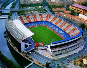
Need to build it back over the road like the Vicente Calderon

Woodwaaard
Active Member
It's good, however, the spacing between the words isn't constant and therefore looks odd to me (yes, I know I'm fussy)Not much impresses me but absolutely bloody fantastic logo on that site!
A couple of small alterations would make it perfect


RammyBlade
We are Bladesmen,Super Bladesmen from the Lane,
- Joined
- Dec 27, 2013
- Messages
- 1,948
- Reaction score
- 2,250
Brilliant from our marketing department

Finn Keane o' Balmaqueen
I've had my fun and that's all that matters.
Brilliant from our marketing department
It's an independent site.
Sheffield Is United.

8lade
Let's do it, let's win the title!
"It's good, however, the spacing between the words isn't constant and therefore looks odd to me (yes, I know I'm fussy)
A couple of small alterations would make it perfect "
Yes I see they've done it like that so that the start and finish of the wording is level but then the spacing is off, I'll bet they mulled how to do it for ages because there isn't going to be a perfect solution.
A couple of small alterations would make it perfect
"Yes I see they've done it like that so that the start and finish of the wording is level but then the spacing is off, I'll bet they mulled how to do it for ages because there isn't going to be a perfect solution.
Woodwaaard
Active Member
Yes I see they've done it like that so that the start and finish of the wording is level but then the spacing is off, I'll bet they mulled how to do it for ages because there isn't going to be a perfect solution.
Yes, it need to more "ten to two" than "quarter to three"
My guess is that they didn't think about for too long

8lade
Let's do it, let's win the title!
I know we shouldn't be bothered but (lockdown) I can't see how that would work with the word 'Sheffield' being so long.Yes, it need to more "ten to two" than "quarter to three"
Woodwaaard
Active Member
'Agreed, we shouldn't be bothered...
The wording isn't level as it is. To my eyes the D in UNITED is below the S in SHEFFIELD
I'd make all the spacing correct and see how it looked in a more "10 to 2" layout
The wording isn't level as it is. To my eyes the D in UNITED is below the S in SHEFFIELD
I'd make all the spacing correct and see how it looked in a more "10 to 2" layout

stringer
Views my own.
- Joined
- Jun 7, 2016
- Messages
- 4,740
- Reaction score
- 6,396
There are as many characters in 'Sheffield' as there are in 'Is United' so it should be easy enough to line up properlyI know we shouldn't be bothered but (lockdown) I can't see how that would work with the word 'Sheffield' being so long.
8lade
Let's do it, let's win the title!
I thought the problem was the actual spaces, to my eye the S and D are level although optical illusion (as they are different shapes) may make it look off. I particularly like the logo 'Sheffield is United'. What do you reckon for something so trivial, can we make it last until the first game?
Woodwaaard
Active Member
I know we shouldn't be bothered but (lockdown) I can't see how that would work with the word 'Sheffield' being so long.
I thought the problem was the actual spaces, to my eye the S and D are level although optical illusion (as they are different shapes) may make it look off. I particularly like the logo 'Sheffield is United'. What do you reckon for something so trivial, can we make it last until the first game?
Easy

What do you reckon to the font?


BettingBlade
Well-Known Member
- Joined
- Aug 25, 2018
- Messages
- 5,279
- Reaction score
- 12,872
Easy
What do you reckon to the font?
I’ve just driven up to Durham and the badge looks perfect now. I’d highly recommend it.

Treeton Blade
Blade for life (despite everything)
That looks great, as long as the river doesn't take out the CricketersThat just highlights how small the Bramall Lane stand is.
Need to build it back over the road like the Vicente Calderon
View attachment 81565

georgebernardshaw
Well-Known Member
- Joined
- Apr 30, 2012
- Messages
- 15,492
- Reaction score
- 25,881
That looks great, as long as the river doesn't take out the Cricketers
.....”Jesus, I swear I can hear water.”


Cerberus Blade
Well-Known Member
- Joined
- Sep 2, 2015
- Messages
- 13,631
- Reaction score
- 20,994
Borstal?That good , But reminds me that it will be the longest i have gone without watching ,. a live Blades game since i was 10 years old .

penthouseblade
Member
That looks great, as long as the river doesn't take out the Cricketers
How about the club buys the Cricketers? Extend the Bramall Lane end over Bramall Lane and assimilate the pub into the stadium....sorted!


Billy Blade
New Member
- Joined
- Apr 19, 2020
- Messages
- 9
- Reaction score
- 2
Lockdown madness
Billy Blade
New Member
- Joined
- Apr 19, 2020
- Messages
- 9
- Reaction score
- 2
Haha seriously, are you two graphic designers... I’m sure if you can make a better version it would be appreciated. Send it to [email protected]Easy
What do you reckon to the font?
Billy Blade
New Member
- Joined
- Apr 19, 2020
- Messages
- 9
- Reaction score
- 2
I’ll try to zoom in and get the plate numbers to report to the police.I find it upsetting at how fast some of those cars are driving in the footage.

diode_blade
Well-Known Member
- Joined
- Sep 17, 2012
- Messages
- 4,836
- Reaction score
- 6,324
Was that a  in the middle of the pitch?
in the middle of the pitch?Similar threads


- Replies
- 1
- Views
- 391


- Replies
- 52
- Views
- 4K
All advertisments are hidden for logged in members, why not log in/register?