The little things...

All advertisments are hidden for logged in members, why not log in/register?

Kozzy_is_my_Dad

"No excuses, no dickheads".
Joined
May 14, 2015
Messages
11,232
Reaction score
27,902
...that currently bother you about owt SUFC or Premier League related. The trivial, picky, largely insignificant stuff that shouldn't matter, but somehow do, somehow are a little bit annoying.

I'll get us started.

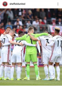
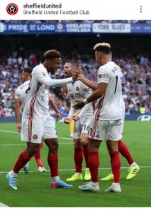
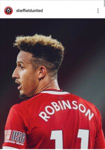
How the club have this annoying tendency to space Robinson's 11 ever so slightly too far apart on his shirt.
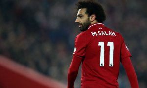
thumb_82800_default_news_size_5.jpeg

Versus

Screenshot_20190928_075151.jpgScreenshot_20190928_075358.jpgScreenshot_20190928_075218.jpg

Well. We do love a moan, and we've got very little to moan about currently in this fantastic time for our club...


Everton's Angry Birds logo on their sleeves annoyed me way more than it should have.

Didn't they have that whilst Rooney was there, you know, in the midst of a fallen out with Colleen. Angry birds, whilst he had an angry bird.
 
Didn't they have that whilst Rooney was there, you know, in the midst of a fallen out with Colleen. Angry birds, whilst he had an angry bird.

An sponsor for Vizs fat slags would be more fitting given who he was having it away with.
 
The BLADES logo in the seats of the BL upper tier should be respaced and more spaced out so that each white letter is in its own section of red seats. Would make the upper tier seem wider to the eye, and be more aesthetically pleasing to me. The current lettering was put in like it is because the upper tier wasn't linked to the westfield corner at the time.

It's not an issue that stops me from sleeping at night though....
 
Screenshot_20190928_090236_com.google.android.apps.maps.jpg

All of the colours, signs, text, pictures, it all looks a bit "busy", messy and cheap. The use of lower case letters in "The Blades" doesn't sit right either.

Apart from that I'm a pretty content Blade at the moment.
 
...that currently bother you about owt SUFC or Premier League related. The trivial, picky, largely insignificant stuff that shouldn't matter, but somehow do, somehow are a little bit annoying.

I'll get us started.

How the club have this annoying tendency to space Robinson's 11 ever so slightly too far apart on his shirt
Versus

View attachment 62011View attachment 62010View attachment 62009

Well. We do love a moan, and we've got very little to moan about currently in this fantastic time for our club...
Not having a space between Sheffield and United.
 
View attachment 62015

All of the colours, signs, text, pictures, it all looks a bit "busy", messy and cheap. The use of lower case letters in "The Blades" doesn't sit right either.

Apart from that I'm a pretty content Blade at the moment.

the statues are a new addition since I last went to the Lane. 2008/9 was my last season before I moved abroad.
 

All advertisments are hidden for logged in members, why not log in/register?

All advertisments are hidden for logged in members, why not log in/register?

Back
Top Bottom