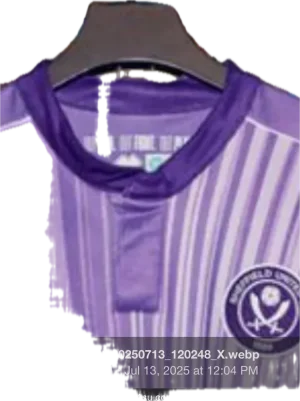
New kit 2025/26

All advertisments are hidden for logged in members, why not log in/register?

Don't hate the design, but the Errea quality is atrocious.

I had a look in the club shop last year at getting the nipper a top, but they were so bad I passed.

I hope we abandon them soon.
Hummels are knocking out some great kits for Coventry amongst others.
 

Remove the badge & sponsor and that is a top my nan would wear to an 'anywhere so long as the foods not too chewy!' lunch with her Over-80's Club friends

Other than that, I see it hanging for many many years in Blades-Shirt Collectors wardrobes, where, upon the doors being opened, it induces a sharp intake of breath and embarrassed cringe!!
 
The people who write our site content need a good talking too on this one. Themes of the film Wild at Heart....

"This is a snakeskin jacket lilac kit! And for me it's a symbol of my individuality, and my belief... in personal freedom"
 
The colour I like.

The pattern, the collar and the weird hippy thing going on with the sleeves I don’t.

Might be tempted by some shorts in the same colour as bedwear though.
 
I don't give a shit about our kits having a story.

I just want them to look half decent, not be made of shite material and be pitched the right price range that is affordable for the average fan.

Piss of Errea.
 
I do wonder if the disgust would be so strong if the logo on the right hand side was a Swoosh or Three Stripes.

I'm partial to a Purple top so depending on how it looks in person, I can see myself picking this us.

Sponsor's logo can make or break a shirt. Midnite's is inoffensive enough to actually enhance the shirt. Refreshing for us. Cat, Jimmy Savill's medal, John Holland, Ramsdens, we've had some stinkers in recent years. Count your blessings.
 
The pattern, the collar and the weird hippy thing going on with the sleeves I don’t.
Brace yourself, it's on all the training gear, and now this. I think it's meant to be 'bespoke' as a crossed swords pattern. Rather cross swords with anyone of you for a piss.

I'd wager it's gonna be on the home and away kits too.
 
I do wonder if there would if the disgust would be so strong if the logo on the right hand side was a Swoosh or Three Stripes.

I'm partial to a Purple top so depending on how it looks in person, I can see myself picking this us.

Sponsor's logo can make or break a shirt. Midnite's is inoffensive enough to actually enhance the shirt. Refreshing for us. Cat, Jimmy Savill's medal, John Holland, Ramsdens, we had some stinkers in the recent years. Count your blessings.
Brand is irrelevant, quality, cheapness, whiteness is what matters for me. They've have several seasons to improve it n'all. They're just a very cheap, poor brand.
 
  • Like
Reactions: RWE

I do wonder if the disgust would be so strong if the logo on the right hand side was a Swoosh or Three Stripes.
You'd never get a swoosh or three stripes on a design like that as they only produce, plain lazy shirts that are just as poorly made but that gets overlooked by brand snobs.
Hummels are knocking out some great kits for Coventry amongst others.
Was looking on York's site and their home kit looks great. Hummel do similar ideas to Errea (the pattern and colours in York's away won't be to everyone's taste) but they look like some effort has gone into all the pieces fitting together like a piece of clothing should.
 
I'm unsure if I'll buy it, but I think it's decent.

3rd kit is an opportunity to do something out of left field; a bit quirky and different. And that's exactly what this shirt is.

If prices of replica shirts weren't so absurd nowadays, I'd buy it. Major question mark for me though over any official shirt these days at £60 a pop
 
Don't hate the design, but the Errea quality is atrocious.

I had a look in the club shop last year at getting the nipper a top, but they were so bad I passed.

I hope we abandon them soon.
Hummels are knocking out some great kits for Coventry amongst others.
Yeah Hummel are smashing it for the last few seasons with Coventry. It was absolutely criminal getting rid of Adidas for Errea. Adidas, Hummel or possibly Umbro for our next brand please 🤞🏼
 
Design 7/10
Colour 1/10

Overall 4/10
Lilac is the most hideous colour. In green, yellow, orange, dark purple, thats a nice kit

The colour I like.

The pattern, the collar and the weird hippy thing going on with the sleeves I don’t.

Might be tempted by some shorts in the same colour as bedwear though.

Exhibit A on how the club are never going to please everyone 😂
 
My tuppence of an opinion, I like the design, as others say, the third kit is a chance to do something different.

Personally, I'd also prefer a deeper shade of purple and I don't get the collar as it looks a bit like someone sewed or on manually after the kit was made.

A round collar or one with a v, and I'd really like it.
 

If Errea could just sort out the quality , although the stuff I’ve bought has been fine , I’d be more than happy if we kept them . Like the designs or not they have tried to be original and have given us some good shirts imho
As ever UTB !
 

All advertisments are hidden for logged in members, why not log in/register?

All advertisments are hidden for logged in members, why not log in/register?

Back
Top Bottom