blade.i.am
Active Member
- Joined
- Feb 1, 2014
- Messages
- 2,003
- Reaction score
- 3,065
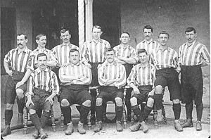
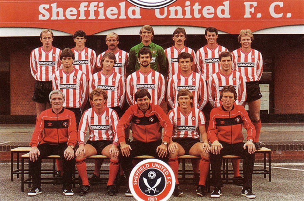
Why would anyone beg to have a company with such an atrocious record of using sweated labour to produce its goods? Clearly only a child, with good eyesight and a steady hand, could produce stripes as thin as that.Mccabes putting 2 fingers up to the fans ...is probably the most insane thing I ve ever read on here . Its a shirt .more than likely theyve took Adidas advice on it .you know the supplier most fans were begging we would change to. We have got what we asked for Adidas s take on red and white stripes


.jpg")

.jpg")


.jpg")

NwBmk~$(KGrHqJ,!jQEw5fJ-7D5BMZmmOZKsQ~~_12.JPG")