Navigation
Install the app
How to install the app on iOS
Follow along with the video below to see how to install our site as a web app on your home screen.

Note: This feature currently requires accessing the site using the built-in Safari browser.
More options
You are using an out of date browser. It may not display this or other websites correctly.
You should upgrade or use an alternative browser.
You should upgrade or use an alternative browser.
Blades Crest Referendum
- Thread starter Katzenjammer
- Start date
All advertisments are hidden for logged in members, why not log in/register?

mattbianco1
Forum Royalty
If i'm being honest, i do like the badge in Black or White. Not keen on matching it to the shirt colour, and i'd never suggest these badges on the home shirt, but i do think they look classy


ReeceofBDTBL
Active Member
- Joined
- Aug 14, 2009
- Messages
- 1,124
- Reaction score
- 3,344
Works well on different away shirts. Will look good in silver/gold when we become the next big footballing dynastyIf i'm being honest, i do like the badge in Black or White. Not keen on matching it to the shirt colour, and i'd never suggest these badges on the home shirt, but i do think they look classy
View attachment 162655View attachment 162656

SouthEssexBlade
...for wit and sage wisdom
How many times have Burnley changed their crest since in the last decade? They seem to be forever buggering about with it every other season. The staying power of ours compared to virtually everyone else in the league is staggering. Getting on for half a century old and still looking fresh with only minor tweaks down the years.
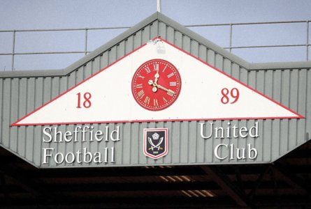
The original concept of the badge is getting on for 75 years. Needing something on the player blazers, Jimmy Hagan designed what in essence is the badge we have. See the great man below, showing his work:

Yoonited
The Times They are a Changing
Distinction is the word ya looking forWe certainly were, but with so many clubs copy and pasting the round badge design these days, we no longer stand out.
I just want a bit more distinctiveness that's all.


- Joined
- Jun 5, 2022
- Messages
- 5,053
- Reaction score
- 16,928
- Thread starter
- Banned
- #126
Distinction is the word ya looking for
You're absolutely right. I normally pride myself on utilising correct grammar and I fully deserve to be called out on this error!
Yoonited
The Times They are a Changing
You're absolutely right. I normally pride myself on utilising correct grammar and I fully deserve to be called out on this error!
.Ness is over utilised for me.I'm not the grammer police, just dislike it's unimaginative usage."Togetherness" is a bugbear .....when the word unity says so much more.Small things eh

- Joined
- Jun 5, 2022
- Messages
- 5,053
- Reaction score
- 16,928
- Thread starter
- Banned
- #128
"Togetherness" is a bugbear .....when the word unity says so much more.Small things eh
Should be "togethertion"
Yoonited
The Times They are a Changing
Tha might be onto summat theerShould be "togethertion"

SouthEssexBlade
...for wit and sage wisdom
Should be "togethertion"
togethering
- Joined
- Jun 5, 2022
- Messages
- 5,053
- Reaction score
- 16,928
- Thread starter
- Banned
- #131
togethering
Sounds almost romantic.
Ey up treacle, fancy a bit of togethering tonight?
*Yes I'm very much single at the moment.
SouthEssexBlade
...for wit and sage wisdom
Sounds almost romantic.
Ey up treacle, fancy a bit of togethering tonight?
*Yes I'm very much single at the moment.
It is more active than the passive togethertion.
Sheffsteel
Well-Known Member
- Joined
- Jul 18, 2015
- Messages
- 11,674
- Reaction score
- 23,399
Not being biased but always thought our badge is a design master piece.
There’s no fuss, it shows our knickname emblem, year formed and the white rose representing our county.
However what makes it stand out is it’s simplicity making it instantly recognisable.
When you see all the badges on match of the day, ours is one of the best.
There’s no fuss, it shows our knickname emblem, year formed and the white rose representing our county.
However what makes it stand out is it’s simplicity making it instantly recognisable.
When you see all the badges on match of the day, ours is one of the best.
- Joined
- Jun 5, 2022
- Messages
- 5,053
- Reaction score
- 16,928
- Thread starter
- Banned
- #134
Current numbers show that 395 people thought my idea was wank.
That's over a tenth of the amount that Wednesday took to QPR.
This........ has been a humbling experience.
That's over a tenth of the amount that Wednesday took to QPR.
This........ has been a humbling experience.
SUFCinks
Well-Known Member
- Joined
- Jul 10, 2011
- Messages
- 2,883
- Reaction score
- 4,754
I think ours could do with some subtle refinements to make it exceptional but overal it’s a good badge as it is.
I love the simplicity and elegance of our mono logo and personally would be happy for us to use this much more.


Only issues i have with the current is that the red could be a slightly more premium shade instead of sports direct red. The yorkshire rose could be reworked a little and include some of the gold colouration from the blades handle.
I love the simplicity and elegance of our mono logo and personally would be happy for us to use this much more.
Only issues i have with the current is that the red could be a slightly more premium shade instead of sports direct red. The yorkshire rose could be reworked a little and include some of the gold colouration from the blades handle.
RossingtonBlade
Member
- Joined
- Jan 21, 2017
- Messages
- 624
- Reaction score
- 850
I’m late to the party but I bet 85 out the other 91 would kill for our badge

ISZA ⚔️
Well-Known Member
- Joined
- Jan 5, 2021
- Messages
- 2,919
- Reaction score
- 6,297
Don’t mind it. Nowt on our badge though. Maybe on a third shirt.
SouthEssexBlade
...for wit and sage wisdom
Almost the same as the original badge, as I mentioned earlier, designed by Hagan for the players blazers.

- Joined
- Jun 5, 2022
- Messages
- 5,053
- Reaction score
- 16,928
- Thread starter
- Banned
- #142
So then chaps, chapesses and non-chapperies.
It's been a closely-fought referendum as you can clearly see, but with 440 voters (93%) thinking it's a wank idea, 138 death threats, 7 countries threatening to cut off diplomatic ties with the UK, one excommunication from the Pope and a DM from the Dalai Lama calling me a "fucking nobcheese", I feel that I must reluctantly concede defeat in this contest.
The badge on the shirt remains unaltered.
And democracy is awful.
Love you xxx
SouthEssexBlade
...for wit and sage wisdom
So then chaps, chapesses and non-chapperies.
It's been a closely-fought referendum as you can clearly see, but with 440 voters (93%) thinking it's a wank idea, 138 death threats, 7 countries threatening to cut off diplomatic ties with the UK, one excommunication from the Pope and a DM from the Dalai Lama calling me a "fucking nobcheese", I feel that I must reluctantly concede defeat in this contest.
The badge on the shirt remains unaltered.
And democracy is awful.
Love you xxx
Blind Pew is on his way with a present for you. I'd say you've got off lightly
TJB.
"What's the biggest room in your house?..."
Yep, that's the badger. Pretty much exactly what I had in mind. You could maybe make the outline of the shield much thinner or even remove it altogether. But that looks excellent.
SouthEssexBlade
...for wit and sage wisdom
Yep, that's the badger. Pretty much exactly what I had in mind. You could maybe make the outline of the shield much thinner or even remove it altogether. But that looks excellent.
The people have spoken. The roundel badge as is will be the official club badge, to be used around the ground and on match shirts. Minimalist, shield etc can officially do one.
idleurchin
International Arm Stealer
Beautiful shirt that isWell it takes their mind off what they ought to be doing.
Having said that and having said previously here I'm not totally against modifications to the badge.
Providing the rose, cutlasses and lettering remain in a ball configuration, unlike my example, where the date aught to curve following the circumference of the clubs name.
As I said, previously, colour changes without altering the dynamics for refreshening if required, fitting in with colour schemes. View attachment 162549
Houston_Blade
Well-Known Member
Foxy and Linz will be pleased that this forum has been moved onto the 'most wanted terrorist organisations list' in 152 countries!We could always give this a try?
Sure it's the symbol of The Muslim Brotherhood, who are an internationally proscribed terrorist organisation, but since when have we ever cared about being popular?
View attachment 162641
- Joined
- Jun 5, 2022
- Messages
- 5,053
- Reaction score
- 16,928
- Thread starter
- Banned
- #148
Foxy and Linz will be pleased that this forum has been moved onto the 'most wanted terrorist organisations list' in 152 countries!
#sheffieldunitedfansareaworldwidedisgrace
Wards
Well-Known Member
It's a shame there's no middle ground in your vote as I think there's some merit in certain situations. Alas, I've had to vote 'wank' anyway.
HackeyBlade
Member
- Joined
- Jun 10, 2019
- Messages
- 375
- Reaction score
- 634
I hate the minimalist badges, they remind me of wank tech startup companies you see see on gofundme. We're a gritty Northern football club not a fucking Silicon Valley software developer
All advertisments are hidden for logged in members, why not log in/register?